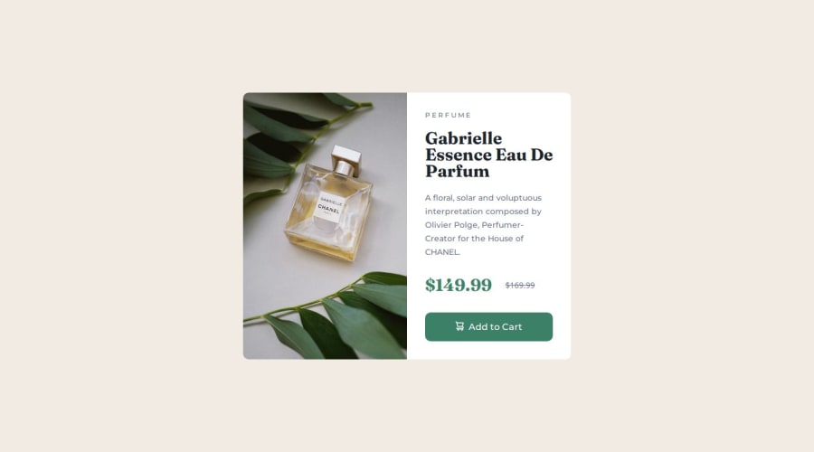
Product preview card components using CSS Flexbox and media query
Design comparison
Solution retrospective
Tell me if i did something wrong guys ^^!
Community feedback
- @danielmrz-devPosted 10 months ago
Hello @alemdaphelan!
Your solution looks great!
I have a suggestion for improvement:
- Use
<main>to wrap the main content instead of<div>.
📌 Tags like
<div>and<span>are typical examples of non-semantic HTML elements. They serve only as content holders but give no indication as to what type of content they contain or what role that content plays on the page.This tag change does not impact your project visually and makes your HTML code more semantic, improving SEO optimization as well as the accessibility of your project.
I hope it helps!
Other than that, great job!
Marked as helpful1@alemdaphelanPosted 10 months ago@danielmrz-dev thank you so much !!!It was very great to receive your feedback.
1 - Use
- @IamparvesPosted 10 months ago
Hello, @AlemDaphelan. Your design looks fantastic. However, there is a minor issue. Try resizing the browser's height to see the effect.
When the browser window height is small, the entire card is not shown and cannot be scrolled. That's because you used the fixed height and overflow hidden properties.
To fix that instead you can use min-height as well as remove the overflow hidden completely.
body {
   min-height: 100vh;
}
Marked as helpful1
Please log in to post a comment
Log in with GitHubJoin our Discord community
Join thousands of Frontend Mentor community members taking the challenges, sharing resources, helping each other, and chatting about all things front-end!
Join our Discord
