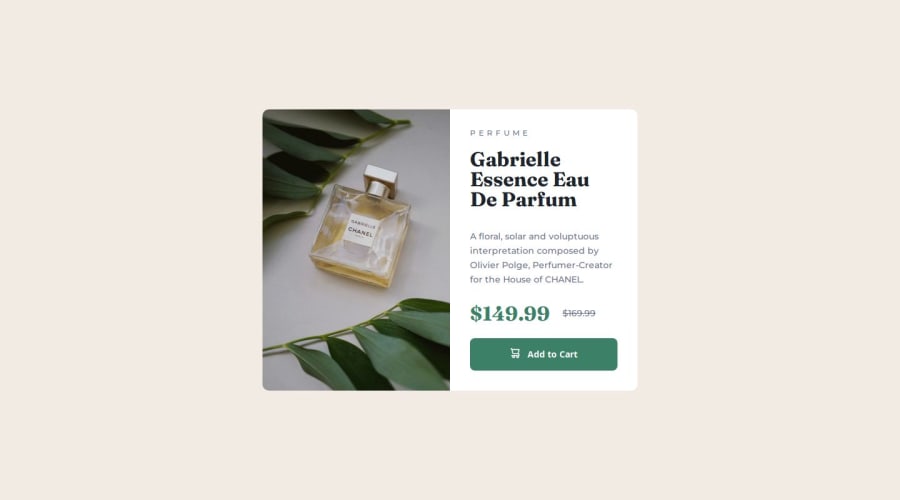
Design comparison
SolutionDesign
Solution retrospective
What are you most proud of, and what would you do differently next time?
I did it, but I still haven't learned about accessibility
What challenges did you encounter, and how did you overcome them?I added the icon to the button with a pseudo element and thus I got a little stuck on the vertical positioning, I solved it with flexbox. But I don't know how correct this solution is.
What specific areas of your project would you like help with?I can't say anything about this challenge right now
Community feedback
Please log in to post a comment
Log in with GitHubJoin our Discord community
Join thousands of Frontend Mentor community members taking the challenges, sharing resources, helping each other, and chatting about all things front-end!
Join our Discord
