

Design comparison
SolutionDesign

Solution retrospective
What are you most proud of, and what would you do differently next time?
The things I'm most proud of
- shortening the style code using sass and mixins like
@function rem($pixels, $context: 16){
    @return calc($pixels / $context)* 1rem;
};
- You can add more components to the page easily -It's a mobile first design
@mixin breakpoint($size) {
    @media (min-width: map-get($breakpoint_up, $size)) {
        @content;
    }
}
- add rel="noopener noreferrer" to attribute to fix security problems
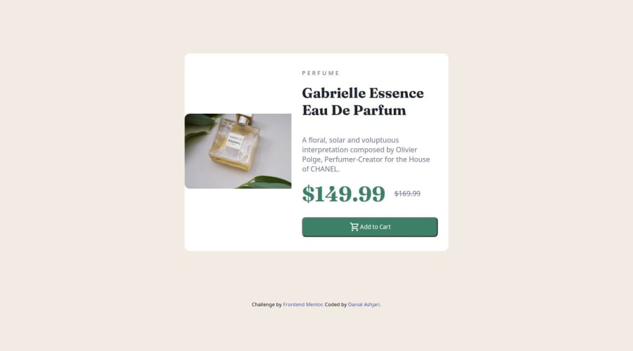
please please please how do i fix the img in desktop view
html
in desktop view there's a small white bar below the img this is the style
            img {
                max-inline-size: 100%;
                block-size: auto;
                height: 320;
                aspect-ratio: 340/240;
                object-fit: cover;
                border-top-left-radius: 0.75rem;
                border-top-right-radius: 0.75rem;
                @include breakpoint(medium){
                    border-top-left-radius: 0.75rem;
                    border-top-right-radius: 0;
                    border-bottom-left-radius: 0.75rem;
                    height: max-content;
                    aspect-ratio: 300/535;

                }
Community feedback
- @Fender60Posted 5 months ago
Hi. To make the image look normal you need the container to be the full height of the block, also you used the object-fit: cover. When object-fit: cover is applied, the image or video is scaled to completely cover the container, but may be cropped at the edges if its aspect ratio is not the same as the container's aspect ratio. For an image, you can try applying the max-width: 100%. Good luck with this.
Marked as helpful1

Please log in to post a comment
Log in with GitHubJoin our Discord community
Join thousands of Frontend Mentor community members taking the challenges, sharing resources, helping each other, and chatting about all things front-end!
Join our Discord