Not Found
Not Found
Not Found
Not Found
Not Found
Not Found
Not Found
Not Found
Not Found
Not Found
Not Found
Not Found
Not Found
Not Found
Not Found
Not Found
Not Found
Not Found
Not Found
Not Found

Submitted

Product preview card component

Yokene 50

@Yokene

Desktop design screenshot for the Product preview card component coding challenge

This is a solution for...

  • HTML
  • CSS
1newbie
View challenge

Design comparison


SolutionDesign

Solution retrospective


What are you most proud of, and what would you do differently next time?

Okay, I'm proud that I finished it, because I started doing it about 2 months ago, then I got burnt out, plus this project was unique to me, because I never used the Grid function.

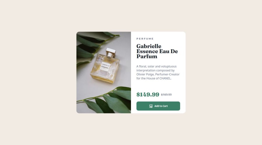
What challenges did you encounter, and how did you overcome them?

The difficulties were with the picture, which needed to be moved to the left, and replacing the picture when changing the screen resolution (for mobile screens). With the picture that should be on mobile screens, I decided with the help of ChatGPT, I asked him how to do this, he told me the source function and the problem was solved quickly. The second problem is the price tag and the button for purchasing the product. I solved the problem simply by thinking and using additional div elements.

What specific areas of your project would you like help with?

I don't need help right now, but I want to learn more about Grid functions and others.

Community feedback

@TedJenkler

Posted

Hi @Yokene,

Nice project! Here are a couple of suggestions for improvement:

Flexbox & Div Reduction: Instead of relying on multiple <div> elements to structure your component, consider using Flexbox. This allows you to stack content with flex-direction: column, reducing unnecessary <div>s, which will make your code cleaner and improve both SEO and accessibility. Also, try using semantic HTML tags like <main>, <section>, or <article> where appropriate.

Headings Usage: I noticed that you are using <h1>, <h2>, and <h3> for styling purposes rather than their intended meaning. Headings should reflect the importance of the text, not just the style. This will improve your SEO score and accessibility, as search engines and screen readers rely on the proper use of headings to understand the structure of your content.

Keep up the great work!

Best, Teodor

Marked as helpful

0
MikDra1 6,070

@MikDra1

Posted

If you want to learn about green I highly encourage you to check this VIDEO, but also try this platform on which you can do tasks related to grid -> PAGE

Hope you found this comment helpful 💗💗💗

Good job and keep going 😁😊😉

Marked as helpful

0

Please log in to post a comment

Log in with GitHub
Discord logo

Join our Discord community

Join thousands of Frontend Mentor community members taking the challenges, sharing resources, helping each other, and chatting about all things front-end!

Join our Discord