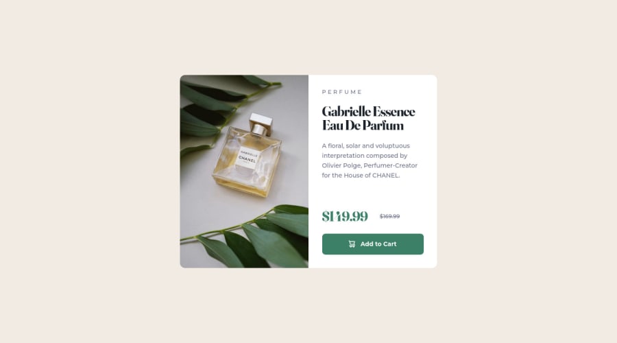
Design comparison
Solution retrospective
Hi! It's been a while since I worked on a front-end project, so I took this challenge to practice my workflow and process. The goal is simple enough so I didn't use any frameworks, just regular HTML and CSS. I used Flexbox to layout the elements in the card, and to position the card itself at the center of the viewport in desktop view.
I made some decisions that were meant to improve accessibility, such as putting the card title first in the source code, before the image and the product category elements, and then using the order property to position them according to the design. This way, the card image and category will still be recognized as related to the card title. Is my thinking in the right direction here?
Accessibility experts, any thoughts or recommendations on how to make this project more accessible?
Community feedback
Please log in to post a comment
Log in with GitHubJoin our Discord community
Join thousands of Frontend Mentor community members taking the challenges, sharing resources, helping each other, and chatting about all things front-end!
Join our Discord
