

Design comparison

Community feedback
- @grace-snowPosted almost 2 years ago
I’m afraid there’s problems in this with html and styles. Hopefully it will help as I go through them
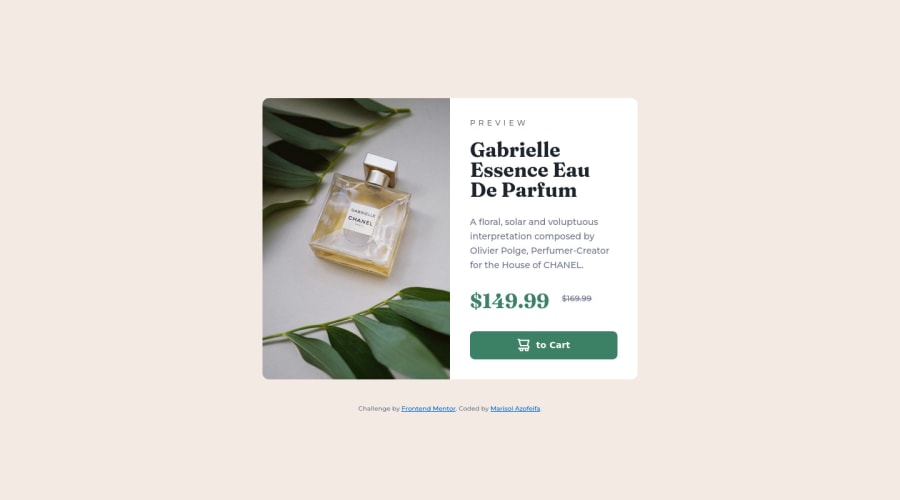
- the image on a product card is meaningful content so should be in the html and with a proper alt description. You should be using the picture element so the browser can swap them for you. This is also more performant than background images and makes all the sizing and positioning easier - so it’s a win on many counts!
- the h2 should be a paragraph
- the h3s should be in one paragraph or two paragraphs
- The old price has to be in an
sor adelelement. It also needs some visually hidden text eg in a span to say that’s the old price (screenreader users are not told when a text has been styled as strike-through so they would hear both prices announced) - you’ve missed the “add” word in the button
- height 100vh makes this break on my phone (I’ll add screenshots in slack for you to see). Instead, use min-height
- you must never limit height on components that have text content inside. Editors need to be able to change the amount of content or users need to be able to change their font size settings without it breaking. There is no reason at all to set a max-height anywhere in this
- font size must NEVER be in px. Use rem. Very important
- same with letter spacing, never in px. Use em so it always scales with the font size.
- same with line height, never px. That is usually unitless like 1.6 or it can be written as %. All three of these properties never being in px is extremely important, because users need to be able to change font size settings
- the button should not have a height. Use padding
- you should only need one media query on this.
- next time make sure you work mobile first
Marked as helpful0@hatchcloudPosted almost 2 years ago@grace-snow thank you Grace, i updated the project about this point: I use a tooltip, is that correct? The old price has to be in an s or a del element. It also needs some visually hidden text eg in a span to say that’s the old price (screenreader users are not told when a text has been styled as strike-through so they would hear both prices announced)
Also, I added the IMG, thanks for the SEO tip I really appreciate your feedback have a nice weekend
0 - @MJEstacioPosted almost 2 years ago
Hi there Marisol,
You can use footer for the attribution use
position: absolute;, bottom: 0;, and put a URL for repository so that others can see your code.Other than that, great work and Happy Coding!
Wow GRAPE! ✌
0


Please log in to post a comment
Log in with GitHubJoin our Discord community
Join thousands of Frontend Mentor community members taking the challenges, sharing resources, helping each other, and chatting about all things front-end!
Join our Discord