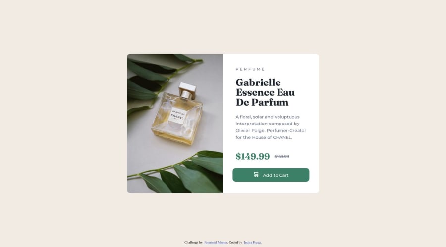
Design comparison
Solution retrospective
The only challenging think that I found was using different images for mobile and desktop component.
I found it challenging because I'm still no aware of the best way to add images depending on media query. What I did was to put a div placeholder where the image goes and update the content with media query. However, later I encountered issues with the sizing of the image and I feel like I hard coded that part of the solution.
Please Let me know what is a better approach for adding dynamic images.
Community feedback
- @Nickil13Posted about 1 year ago
Hey Indira!
A great way of handling dynamic images is using the <picture> HTML element. Within it, specify your default img and add sources with the images you want to have specific breakpoints for. Hope this helps!
Marked as helpful0@indy-stackPosted about 1 year ago@Nickil13 thank you so much. I'll add to my next project. I did a bit of research and the <picture> tag is indeed better since it uses semantic HTML. Thank you so much!
0
Please log in to post a comment
Log in with GitHubJoin our Discord community
Join thousands of Frontend Mentor community members taking the challenges, sharing resources, helping each other, and chatting about all things front-end!
Join our Discord
