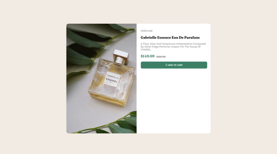
Design comparison
Solution retrospective
Had a lot of fun making my first project just a few weeks into learning HTML and CSS. had a minor problem with the images but I think it's quite good for a first project. open to any feedback, thanks.
update, just applied almost everything you guys suggested me about. had a blast making this one! just had a little bit of problem with the button but the rest turned out perfect!!
it has just been few minutes since I posted this, and the design comparison isn't the same as the live site I attached. is this a normal thing or is there something wrong!??
Community feedback
- @correlucasPosted about 2 years ago
👾Hello @ookamidigital, Congratulations on completing this challenge!
Your solution its almost done and I’ve some tips to help you to improve it:
Use the THE PICTURE TAG that is a shortcut to deal with the multiple images in this challenge. So you can use the
<picture>
tag instead of importing this as an<img>
or using a div withbackground-image
. Use it to place the images and make the change between mobile and desktop, instead of using adiv
orimg
and set the change in the css withdisplay: none
with the tag picture is more practical and easy. Note that for SEO / search engine reasons isn’t a better practice import this product image with CSS since this will make it harder to the image. Manage both images inside the<picture>
tag and use the html to code to set when the images should change setting the devicemax-width
depending of the device desktop + mobile.Check the link for the official documentation for
<picture>
in W3 SCHOOLS:https://www.w3schools.com/tags/tag_picture.asp
See the example below:
<picture> <source media="(max-width:650px)" srcset="./images/image-product-mobile.jpg"> <img src="./images/image-product-desktop.jpg" alt="Gabrielle Parfum" style="width:auto;"> </picture>
👨💻Here's my solution for this challenge if you wants to see how I build it: https://www.frontendmentor.io/solutions/product-preview-card-vanilla-css-and-custom-hover-state-on-hero-85A1JsueD1
Marked as helpful1@ookamidigitalPosted about 2 years ago@correlucas hey, thanks for the amazing feedback! the picture tag was really a thing I did not know about before. very excited to read further into it and apply it in my code. thanks again
1 - @omar-jalalPosted about 2 years ago
-
Hey nice design, here's how you can fix the image you need to give it background-size: contain; and background-repeat: no-repeat;
-
You shouldnt use alot of divs in the HTML it's a bad practice for SEO and WAI-ARIA reasons search about them for more info, and you can't put a <p> inside a <button> too.
-
You can't skip or repeat a head tag you always start from <h1> because every page needs it and you keep ascending from there if you need to add more.
-
You need to wrap everything in the page in <main> tag
-
Use <picture> tag instead of importing the image in the css so you can switch between the desktop and mobile image versions responsively!
-
Hope that was helpful, happy coding!
Marked as helpful1@ookamidigitalPosted about 2 years ago@tiger8707 thanks for the feedback, it was very helpful! made me realize mistakes and things I did not think through. I'll make sure to apply these changes to my code get back with a new refined one.
1 -
Please log in to post a comment
Log in with GitHubJoin our Discord community
Join thousands of Frontend Mentor community members taking the challenges, sharing resources, helping each other, and chatting about all things front-end!
Join our Discord