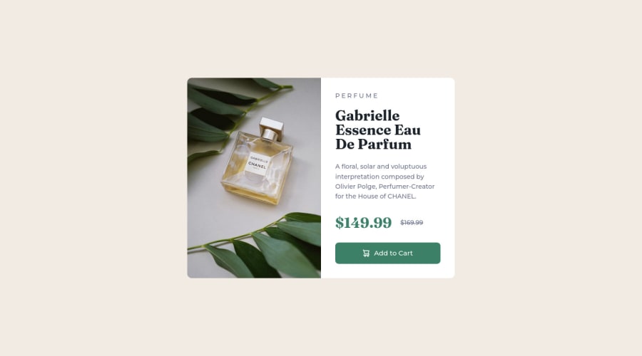
Design comparison
Solution retrospective
I would be happy to receive any feedback
Community feedback
- @MelvinAguilarPosted about 2 years ago
Hello there 👋. Good job on completing the challenge !
I have some suggestions about your code that might interest you.
HTML 📄:
- The product image is not a decoration. You must not use the background-image property to add the product image. Instead, use the
<img>tag to add the image. Use the background-image property only for decorative images that do not add any information to the page.
- You can use the
<picture>tag when you have different versions of the same image 🖼. Using the<picture>tag will help you to load the correct image for the user's device. You can read more about this here 📘.
-
It is generally not recommended to use multiple <h1> tags on a single web page because the <h1> tag is used to mark the most important heading on a web page and it is considered the top-level heading in the document outline. It should be used only once on the page, typically for the title or main heading of the page.
You can read more about this here 📘.
- Not all images should have alt text. The cart-icon is a decorative image, it does not add any information to the page. You should use an empty
altattribute instead of a descriptive one. You can read more about this here 📘.
CSS 🎨:
- The
width: 100vwproperty in thebodytag is not necessary. This will create a horizontal scrollbar on some devices.
- Use
min-height: 100vhinstead ofheight: 100vh. Theheightproperty can cause your component to be cut off on small screens, such as a mobile phone in landscape mode.
-
Using too many selectors can make your code more difficult to read and maintain. Additionally, using too many selectors can lead to specificity issues, making it difficult to override existing styles.
.container .right-section .price span { ... }Use classes only for styling, this way you will keep specificity low and there won't be much of a problem. e.g.
.selector { . . . }
I hope you find it useful! 😄 Above all, the solution you submitted is great!
Happy coding!
Marked as helpful1 - The product image is not a decoration. You must not use the background-image property to add the product image. Instead, use the
- @HassiaiPosted about 2 years ago
There is no need to style the main and to give the body a width value.
To center .container using flexbox, add min-height:100vh; display: flex; align-items: center: justify-content: center; to the body.
To center .container on the page using flexbox:
body{
min-height: 100vh;
display: flex;
align-items: center;
justify-content: center;
}
Use relative units like rem or em as unit for the padding, margin, width values and preferably rem for the font-size values, instead of using px which is an absolute unit. For more on CSS units Click here
Hope am helpful.
Well done for completing this challenge. HAPPY CODING
Marked as helpful1
Please log in to post a comment
Log in with GitHubJoin our Discord community
Join thousands of Frontend Mentor community members taking the challenges, sharing resources, helping each other, and chatting about all things front-end!
Join our Discord
