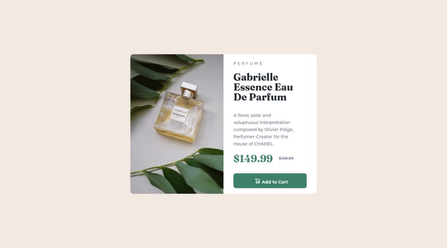
Design comparison
Solution retrospective
Ideally, the media query would apply when the screen is 375px wide. In my code, however, I've set the max-width to 1000px to make previewing/inspecting the page's responsiveness easier on a desktop device.
Community feedback
- @Gabriel7venPosted almost 2 years ago
Hello! I guess this a interesting approach and a smart solution because we don't need to be worry about screen size devices between 375px and desktop width. When compared ours projects, the my seems more back-breaking and your seems more easy to core. In my project I used two media queries to provide responsiveness. One is '@media only screen and (max-width: 600px)'. The second is '@media only screen and (max-width: 500px)'. Both media queries were placed to fit better the leading panel height. Thank you so much for your solution, it helped me a lot. I'm sorry if I made some grammar mistakes in this feedback, I'm a Brazilian learning english.
Marked as helpful1
Please log in to post a comment
Log in with GitHubJoin our Discord community
Join thousands of Frontend Mentor community members taking the challenges, sharing resources, helping each other, and chatting about all things front-end!
Join our Discord
