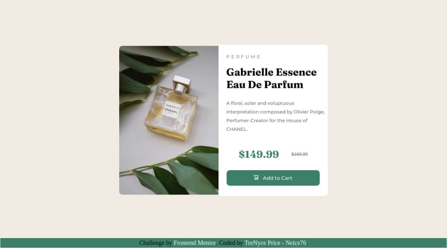


Design comparison

Solution retrospective
Just finished another challenge. I struggled getting the product description to align right. I was wondering if I can get feedback on how to improve my CSS so the product texts are aligned right.
Community feedback
- @fa7ehPosted over 1 year ago
Great work 👍🏽
I have few suggestions for you.
-
You are using id's for each element and then style them using id's. Use class instead of Id for most part. Because class names are reusable and you can have multiple elements with same class name and one element with multiple class names.
-
Regarding your question about left align of text. You need to do few things for it,
a) Remove your left margins from each element in product description part. Instead give a padding to whole product description part and it will keep all the content inside that padding.
b) Put
text-align: lefton product Description div instead of putting it on individual elements.c) In price section where you specified display:flex change the
justify-contentfrom center to start.I hope you find this useful.
Good luck.
Marked as helpful1 -
- @0xabdulkhaliqPosted over 1 year ago
Hello there 👋. Congratulations on successfully completing the challenge! 🎉
- I have other recommendations regarding your code that I believe will be of great interest to you.
PiCTURE TAG 📸:
- Looks like you're currently using only one image for both versions of screen sizes, Actually there's an easy method were we can provide responsive
image.
- So let me introduce the
pictureelement.
- The
<picture>tag is commonly used for responsive images, where different image sources are provided for different screen sizes and devices, and for art direction, where different images are used for different contexts or layouts.
- Example:
<picture>
  <source media="(max-width: 768px)" srcset="small-image.jpg">
  <source media="(min-width: 769px)" srcset="large-image.jpg">
  <img src="fallback-image.jpg" alt="Example image">
</picture>
- In this example, the
<picture>tag contains three child elements: two<source>elements and an<img>element. The<source>elements specifies different image sources and the conditions under which they should be used.
- Using this approach allows you to provide different images for different screen sizes without relying on CSS, and it also helps to improve page load times by reducing the size of the images that are served to the user
- If you have any questions or need further clarification, you can always check out
my submissionand/or feel free to reach out to me.
.
I hope you find this helpful 😄 Above all, the solution you submitted is great !
Happy coding!
Marked as helpful1@TrenyceCodesPosted over 1 year ago@0xAbdulKhalid thank you so much. That helps a lot I’ll update my code later tomorrow.
Happy Coding!
0Account deleted@Neice76 Saludos Neice, te recomiendo que aprendas flexbox y grid , debido a que estos te facilitaran el desarrollo, recuerda que puedes personalizar tu código, no es necesario que dejes el footer.
0


Please log in to post a comment
Log in with GitHub
Join our Discord community
Join thousands of Frontend Mentor community members taking the challenges, sharing resources, helping each other, and chatting about all things front-end!
Join our Discord