Not Found
Not Found
Not Found
Not Found
Not Found
Not Found
Not Found
Not Found
Not Found
Not Found
Not Found
Not Found
Not Found
Not Found
Not Found
Not Found
Not Found
Not Found
Not Found
Not Found

Submitted

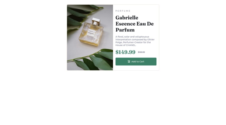
Responsive Product preview card component using flexbox

Prateek Sainiβ€’ 30

@PrateekSaini15

Desktop design screenshot for the Product preview card component coding challenge

This is a solution for...

  • HTML
  • CSS
1newbie
View challenge

Design comparison


SolutionDesign

Solution retrospective


I have faced the following issues while completing this challenge.

  1. Couldn't figure out the which color goes where specially the text color.

  2. The right height and width of the card.

  3. Box-shadow for the card

Community feedback

Abdul Khaliq πŸš€β€’ 72,660

@0xabdulkhaliq

Posted

REPLY:

  • After inspected your code, i want to share a snippet of code that will be usefull for this solution

SNIPPET:

  • This solution lacks the placement of card in center
  • These three rules for centering the card main,

body { display: grid; place-items: center; height: 100vh; }

MESSAGE:

  • If my answer helps you then providing an upvote will be very gratefull
  • I hope you learned a lot of stuffs during this project, Congrats brother

GREETINGS:

  • Peace be upon you with god's mercy & blessings Prateek..✨

Marked as helpful

4

@catherineisonline

Posted

Not bad! At the screen width size of 420px or so the container might need some fix because the button is disappearing

Marked as helpful

1

Prateek Sainiβ€’ 30

@PrateekSaini15

Posted

@catherineisonline

Thanks for noticing it out. According to this challenge do we need to take care of all the pixel values between 1440 and 375 or just what the card look at exactly these two pixel values.

I am new to this so please shed some light.

0
Sinisa Vukmirovicβ€’ 1,690

@SinisaVukmirovic

Posted

@PrateekSaini15 Yeah, I do it like that, take care of it only for the pixel values they provide, not in between.

You could do it for more if you wish.

Marked as helpful

0

@MelvinAguilar

Posted

Hello everyone, @PrateekSaini15, @SinisaVukmirovic, @catherineisonline's

My opinion is the same as @catherineisonline's

When a solution is responsive, it should be responsive on all devices, which is why it should not be used only for those dimensions. The dimensions "1440 and 375" are to determine in which dimensions the images were taken, but it is not recommended to use only those dimensions. On my cell phone, I don't see the button, so I would not be aware of its existence and wouldn't buy the product.

In real life applications, mobile devices are more common than desktop devices, resulting in an awkward user experience for most users.

Regards !

0
Sinisa Vukmirovicβ€’ 1,690

@SinisaVukmirovic

Posted

@MelvinAguilar

This is true for real projects.

And since this is just for practice, to do it only in determined dimensions is fine.

If you can build it for mobile and desktop layouts, building for some in-between dimensions wouldn't be different and you wouldn't learn or apply anything new.

If you can't see his button on mobile, than that's because he didn't build it correctly for mobile , not because it "needs" to be done for other dimensions.

0
Sinisa Vukmirovicβ€’ 1,690

@SinisaVukmirovic

Posted

Hello!

About your questions:

1. Not sure what you mean, colors in your solution looks good to me. I didn't do that challenge, but I am pretty sure it is said where to use which color, in the style guide.

2. You don't need to know the exact dimensions. Try out some value, until it looks as close as to the design.

3. What about box-shadows? See if this helps.

Also, it is a good practice to import google fonts in your CSS. You are setting "font-family" in the CSS, right? It makes sense to import it there, too.

I like how you do your CSS, with layout, utility and component classes.

Try to use semantic elements in your HTML, not just <div>s. Errors in your report are mostly about that.

This "Document should have one main landmark" means you are missing <main> semantic element in your html. Landmark just means element.

This "All page content should be contained by landmarks" means all non-semantic elements should be inside of semantic elements, and not directly inside of <body> element.

Hope this helps! Best of luck!

Marked as helpful

1

Prateek Sainiβ€’ 30

@PrateekSaini15

Posted

@SinisaVukmirovic

Thanks for the feedback I have updated by solution to include main landmark to remove all the error from my report.

You have mentioned that I need to import google fonts in my CSS. I have included them in head tag. Is there a particular reason to import them in CSS and if I import them in CSS can I skip them in my head tag?

Regarding the colors, the style guide do tell me which color to use but doesn't tell me which color goes where until I am missing something here and same goes for the fonts.

I have struggled with box shadow because I can't figure out the color of the shadow in the screenshot provided by the challenge.

0
Sinisa Vukmirovicβ€’ 1,690

@SinisaVukmirovic

Posted

@PrateekSaini15 You don't "need" to import it in the CSS. I said that it is a "good practice" to import it in CSS not HTML. You are setting "font-family" in the CSS, right? Makes sense to import it in CSS.

About the colors, yeah, if they didn't explicitlly said it, you need to guess and try out until you get it as close to the design as possible.

Box shadow, like with colors, use what looks as close to the design as possible, don't stress about it if its a little off.

0

Please log in to post a comment

Log in with GitHub
Discord logo

Join our Discord community

Join thousands of Frontend Mentor community members taking the challenges, sharing resources, helping each other, and chatting about all things front-end!

Join our Discord