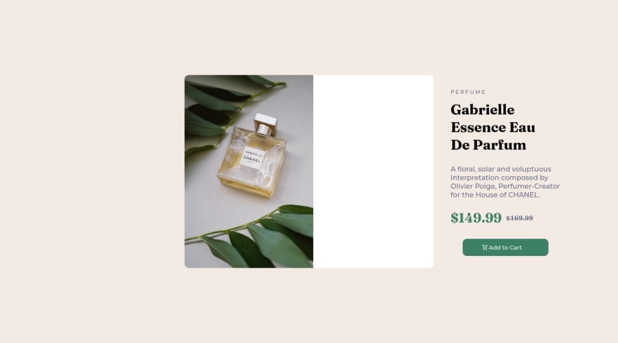


Design comparison

Solution retrospective
Is it regular to write all that @media
Community feedback
- @vitoraragonePosted almost 2 years ago
Hi Matthew!
What I can suggest to you is:
-Try using CSS Grid to separate the image and the content:
.container .card {
    display: grid;
    grid-template-columns; 1fr 1fr;
}
It would help you with responsively and discard the
positionthing AND you won't need to use that much of @media (only in mobile width (375px at style-guide I guess).About mobile design:
- I suggest you to set a break point when the image starts to crush:
@media (max-width: 450px: *the width is a suggestion*)  {
 .card {
    grid-template-columns: 1fr
}

 .mob {
    display: block;
}
Hope this can help you to find a way to improve your project. Keep coding.
(I'm new at this thing. Feel free to correct me:)-)
Marked as helpful0@matthew-marcoPosted almost 2 years ago@vitoraragone okay i will try that thank you so much for helping
0 - @nelsonleonePosted almost 2 years ago
it looks nice , but the ADD-TO-CART-BUTTON , make the image to be nested in the button and use a display flex and a width 100% on the button , not positioning for the cart image . See if you like that better.
Positioning can work also, set a position relative on the parent element first so the element on absolute position doesn't look funny and screen resize and browsers.
Marked as helpful0 - @thekarthikrPosted almost 2 years ago
Hi there, You can try
<picture>element instead of writing media queries for the image.<picture> <source media="(min-width: 650px)" srcset="img_lg.jpg"> <source media="(min-width: 465px)" srcset="img_s.jpg"> <img src="img-xs.jpg"> </picture>That would be so easier. Hope it helps , Have a great time.
0


Please log in to post a comment
Log in with GitHub
Join our Discord community
Join thousands of Frontend Mentor community members taking the challenges, sharing resources, helping each other, and chatting about all things front-end!
Join our Discord