Design comparison
Solution retrospective
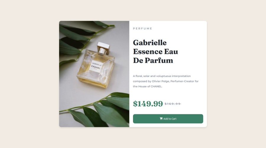
One thing I am proud of is completing the project and getting a similar solution. I am still new to flex containers and still trying to navigate my way to creating successful layouts this project has helped me get a better understanding.
What challenges did you encounter, and how did you overcome them?One challenge I face was creating the card and having the content layout side by side in uniform with flex containers having all the content together is easy but when it comes down to styling the card and having the content in the right position going in the right direction is where I had trouble. I overcame my problem by doing research and using chatgbt for a better understanding on how to layout my content.
What specific areas of your project would you like help with?Flex box and grid.
Please log in to post a comment
Log in with GitHubCommunity feedback
- @Mouadasel
There is a problem with card size compared to design
Join our Discord community
Join thousands of Frontend Mentor community members taking the challenges, sharing resources, helping each other, and chatting about all things front-end!
Join our Discord
