

Design comparison

Solution retrospective
Being able to complete this project. And trying to understand the use of flex.
What specific areas of your project would you like help with?My code in regards to setting the @media queries, I felt as if by default I needed to wrap all my code for it to be be viewed on min 375px, then anything after I added code separately of how i wanted it to be viewed differently. It would be good to have some guidance on the layout of the code. For viewport 376px and above, I had struggled to get the price, button and footer to the bottom left underneath the product description. Also the size of the button and couldn't change the background colour of the button.
Community feedback
- @beowulf1958Posted 5 months ago
Great job finishing the challenge. I have a few suggestions for further development.
First, the html does not validate, because there is an open <div> with no closing </div>; you need to add the closing </div> tag just before the closing </body> tag.
Second, you are using <h1> and <h4> in class="discount" section for styling purposes (because of their relative sizes) but this is bad practice: <h1> is for the title of a page, or the main heading, and <h4> is for a subheading. Also you have the heading tags in a <div> inside another <div> which is confusing the styling. Try this instead:
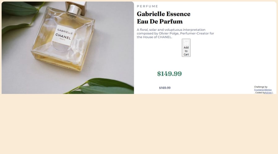
       <div class="discount">
        <p class="og_price">$149.99</p>
        <p class="price"><s>$169.99</s></p>
      </div>
Now you can style them easily:
      .discount {
        display: flex;
        align-items: center;
        gap: 20px;
        margin: 10px 20px;
      }
      .og_price {
        font-family: "Fraunces", serif;
        font-weight: 700;
        color: hsl(158, 36%, 37%);
        font-size: 2rem;
      }

      .price {
        color: hsl(228, 12%, 48%);
      }
Lastly, you don't need a <div> for your <button>; remove the div and give the button a class of button, and style the button class. This will help with the flex inside the button. Also the cart icon needs a width and height to fit better. Try adding to the button style:
.button {
        display: flex;
        justify-content: center;
        align-items: center;
        border-radius: 5px;
        color: white;

        /* add */
        background-color: hsl(158, 36%, 37%);
        font-size: inherit;
        gap: 10px;
        margin-left: 20px;
        width: 270px;
        height: 40px;
        img {
          width: 25px;
          height: 25px;
        }
      }
Hope this helps.
Marked as helpful0 - @ShoaibShujaPosted 5 months ago
A tip for you my friend is that do not put media query at the beginning of your code especially when you are in the beginning phases and a better approach is finishing the design for laptop or desktop view then applying the media queries for smaller devices and also when applying media queries do not use
min-widthif your target is smaller devices. You did amazing but I suggest you watch some tutorials like videos because I did the same when I first started, and it helps a lot.Have a nice day.
Marked as helpful0 - @danielmrz-devPosted 5 months ago
Hello there!
Congrats on completing the challenge! ✅
Your project looks great!
I have a suggestion about your code that might interest you:
📌 You can use the
<picture>tag when you have different versions of the same image.Using the
<picture>tag will help load the correct image to the user's device, saving bandwidth and improving performance.Example:
<picture>
    <source media="(min-width: 768px)" srcset="{desktop image path here}">
    <img src="{mobile image path here}" alt="{alternative text here}">
</picture>
I hope this helps!
Other than that, excellent work!
0


Please log in to post a comment
Log in with GitHub
Join our Discord community
Join thousands of Frontend Mentor community members taking the challenges, sharing resources, helping each other, and chatting about all things front-end!
Join our Discord