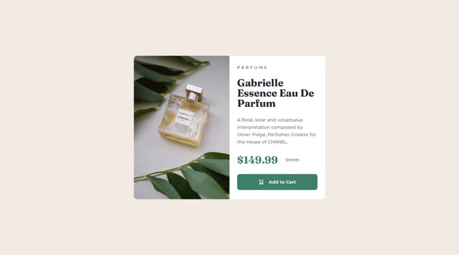
Product Preview Card Component with Vanilla HTML & CSS


Design comparison

Solution retrospective
Setting up the project with snippets of my usual CSS Reset
What challenges did you encounter, and how did you overcome them?Getting the image to change on mobile and desktop. Overcome them with putting both the image in the HTML and display: none on breakpoint.
Community feedback
- @i000oPosted 4 months ago
Hi!
In regards to the picture, look up 'art direction' where you as a dev can ask the browser to swap out different images (in this case, although the image is the same but the crop is different, think of them as different images) depending on the viewport. This way it only loads one based on the conditions you outline.
I'm adding a code snippet of what I wrote in in my solution. In this instance, you need to house the
<img>tag and others includingsrcsetwithin a<picture>tag for it to work.<picture> <source srcset="images/image-product-mobile.jpg" media="(max-width: 425px)"> <source srcset="images/image-product-desktop.jpg" media="(min-width: 426px)"> <img src="images/image-product-mobile.jpg" alt="image of perfume"> </picture>Hope this helps! I think it's a more useful thing to know than to opt for
display: none;with both loaded.Marked as helpful1@kmlrdzwnPosted 4 months ago@i000o Thanks for this, I have change my code to yours, but my problem now is the picture height looks weird. Do I change the height so that it matches the bottom details?
EDIT: Finally solve the height bug, I use a larger breakpoint on the image source.
0

Please log in to post a comment
Log in with GitHub
Join our Discord community
Join thousands of Frontend Mentor community members taking the challenges, sharing resources, helping each other, and chatting about all things front-end!
Join our Discord