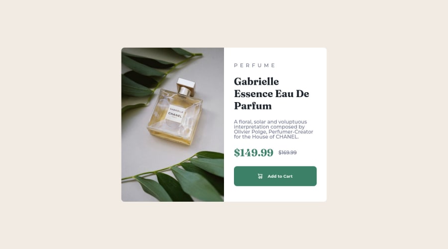
Submitted over 1 year ago
Product preview card component with Sass
@oliveiratales
Design comparison
SolutionDesign
Community feedback
- @frank-itachiPosted over 1 year ago
Hello there 👋. You did a good job!
I have some suggestions about your code that might interest you.
HTML 📄:
- Wrap the page's whole main content in the
<main>tag. - The heading order is important in the html structure so try to always start your headings and/or titles with an
<h1>tag and then you can decrease by one if you need to use more headings in your html code. - Since the mobile design has a different image, you can use the
<picture>tag that allows you to interchange the images depending of the viewport size. Red more about this awesome tag here
I hope you find it useful! 😁😁 Above all, the solution you submitted is great👌!
Happy
<coding />😎!Marked as helpful0@oliveiratalesPosted over 1 year agoHi Francisco,
Thank you very much for the tips, I already change the tags that you described above. I will use it for my next projects.
Best regards, Tales.
0 - Wrap the page's whole main content in the
Please log in to post a comment
Log in with GitHubJoin our Discord community
Join thousands of Frontend Mentor community members taking the challenges, sharing resources, helping each other, and chatting about all things front-end!
Join our Discord
