Submitted about 2 years agoA solution to the Product preview card component challenge
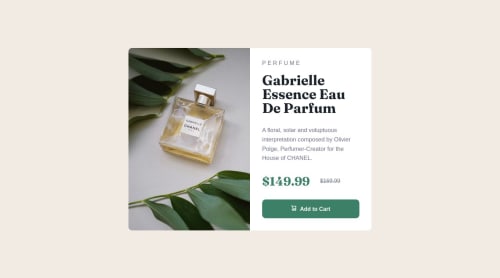
Product Preview Card Component with HTML/CSS/Flexbox and Grid
P
@jclegg31

Solution retrospective
Pretty good exercise in just trying to build things from scratch vs watching tutorials. Challenging and hopefully I got pretty close.
Struggled with the responsiveness with the photo and text. Doesn't look great in between the two and not sure how to fix it. Would love suggestions, maybe I took the wrong approach? Thanks!
Code
Loading...
Please log in to post a comment
Log in with GitHubCommunity feedback
No feedback yet. Be the first to give feedback on Julie's solution.
Join our Discord community
Join thousands of Frontend Mentor community members taking the challenges, sharing resources, helping each other, and chatting about all things front-end!
Join our Discord