Not Found
Not Found
Not Found
Not Found
Not Found
Not Found
Not Found
Not Found
Not Found
Not Found
Not Found
Not Found
Not Found
Not Found
Not Found
Not Found
Not Found
Not Found
Not Found
Not Found

Submitted

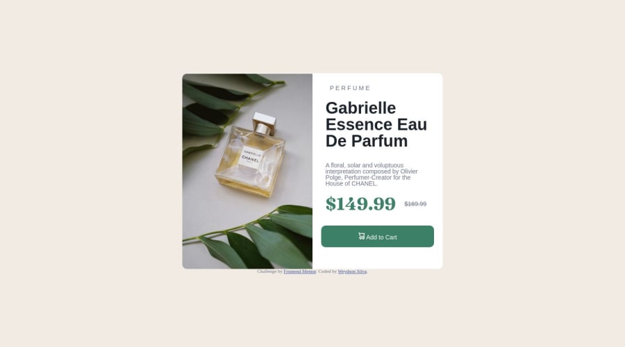
Product preview card component with html css + flexbox

weydsonlinoβ€’ 30

@weydsonlino

Desktop design screenshot for the Product preview card component coding challenge

This is a solution for...

  • HTML
  • CSS
1newbie
View challenge

Design comparison


SolutionDesign

Solution retrospective


I'm having a bit of trouble with some aspects of the css. So please give me tips and reviews.

Estou tendo um pouco de dificuldade com alguns aspectos do css. EntΓ£o por favor me dΓͺm dicas e avaliaçáes

Community feedback

Abdul Khalid πŸš€β€’ 72,700

@0xabdulkhalid

Posted

Hello there πŸ‘‹. Congratulations on successfully completing the challenge! πŸŽ‰

  • I have other recommendations regarding your code that I believe will be of great interest to you.

PiCTURE TAG πŸ“Έ:

  • Looks like you're currently using single image for both Desktop & Mobile devices, but we want to swap images according to their screen sizes. Luckily there's a native html element which may help us to achieve this method without need of css
  • So let me introduce the picture element.
  • The <picture> tag is commonly used for responsive images, where different image sources are provided for different screen sizes and devices, and for art direction, where different images are used for different contexts or layouts.
  • Example:
<picture>
<source media="(max-width: 768px)" srcset="small-image.jpg">
<source media="(min-width: 769px)" srcset="large-image.jpg">
<img src="fallback-image.jpg" alt="Example image">
</picture>
  • In this example, the <picture> tag contains three child elements: two <source> elements and an <img> element. The <source> elements specifies different image sources and the conditions under which they should be used.
  • Using this approach allows you to provide different images for different screen sizes without relying on CSS, and it also helps to improve page load times by reducing the size of the images that are served to the user
  • If you have any questions or need further clarification, you can always check out my submission and/or feel free to reach out to me.

.

I hope you find this helpful πŸ˜„ Above all, the solution you submitted is great !

Happy coding!

0

Please log in to post a comment

Log in with GitHub
Discord logo

Join our Discord community

Join thousands of Frontend Mentor community members taking the challenges, sharing resources, helping each other, and chatting about all things front-end!

Join our Discord