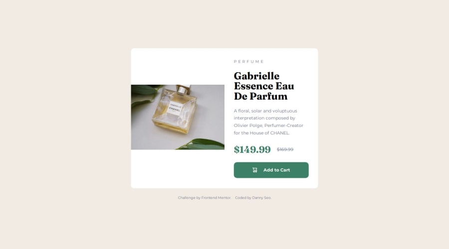
Design comparison
Solution retrospective
I used a grid for the first time, and for the next project, I want to work faster and more efficiently.
What challenges did you encounter, and how did you overcome them?When switching to the desktop view, the product image wasn't displaying correctly at half the size of the container. I was able to resolve this by looking at others' work and conducting some research.
What specific areas of your project would you like help with?I would like to have more explanations and examples on responsive layouts.
Community feedback
- @marliedevPosted about 2 months ago
Hi! Looks fine on mobile. But you should defenitly change the body-height to an min-height of 100vh. Otherwise the card is cropped in landscape mode.
Also you dont need a header-landmark here. This Landmark should only be used for e. g. a header of a Website where normally a logo and nav is inside.
Additionally the Breakpoint should bei set to 768px. 1400 is far too high, since the max-width of the card is 600px
I'll try to given Feedback in Desktop too soon.
0
Please log in to post a comment
Log in with GitHubJoin our Discord community
Join thousands of Frontend Mentor community members taking the challenges, sharing resources, helping each other, and chatting about all things front-end!
Join our Discord
