Design comparison
Solution retrospective
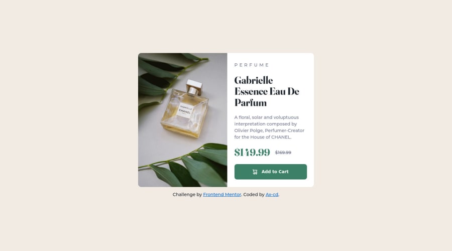
Hi! This is my solution for the challenge. I wanted to pratice styling with a design system in CSS so feedback on how I wrote the code is welcome :) Also: the border radius of the top right corner seems to turn into a right angle corner at 453px (viewport), which is too soon - so if you have an idea on how I could fix it, suggestions are welcome. Thank you!
Community feedback
- @pradeeps4iniPosted over 2 years ago
Hi, @Ax-cd. How are you?
You've done an awesome job implementing the design.
-
You can fix the image border angle turning into a right angle by removing the radius property from image and setting the overflow: hidden, property on the ".card" element. When you set overflow:hidden, the image overflowing from the corners of the card is hidden and the curved angle of the card is shown.
-
In the CSS reset, you've already written "margin: 0;". You don't need it in this style declaration after that.
body, h1, h2, h3, h4, h5, h6, p, figure, picture { margin: 0; } -
For the prices section, you've used <span>. You use <span> for the text when you don't have any other semantic element available. Instead of <span>, i'd use <li> element there.
You've done a great job working with utilities. I like how how wrote your css.
Marked as helpful0@Ax-cdPosted over 2 years agoHi, @pradeeps4ini I'm doing just fine, I hope you too!
The overflow: hidden hadn't cross my mind! It's much more easier to implement than what I had done. I also removed the margin: 0, and changed the <span> to <li> like you suggested.
Thank you so much for the feedback!
0 -
Please log in to post a comment
Log in with GitHubJoin our Discord community
Join thousands of Frontend Mentor community members taking the challenges, sharing resources, helping each other, and chatting about all things front-end!
Join our Discord
