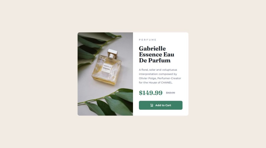
Product Preview Card Component with heavy reliance on flexbox
Design comparison
Solution retrospective
I'm proud of improving my workflow and focusing on efficiency in order to speed up my completion of this challenge.
I'm proud of using gap values to very quickly create general spacing around elements that approximates the design fairly closely. It isn't pixel perfect, but I didn't need to spend a lot of time adding padding or margins to each individual element. I'm happy with the result.
I used flexbox a lot - even within the button to space/place the icon and text.
What challenges did you encounter, and how did you overcome them?I wasn't sure how to make use of the two main image sizes for mobile and desktop but I searched and learned how to have both img elements in my html and show or hide those elements using media queries in my css.
I tried to define element sizes as little as possible to help with responsiveness. It was a challenging to ignore some of the clear widths and heights in the figma file and use relative values in my css to achieve what I was after.
What specific areas of your project would you like help with?What is considered "close enough" in terms of balancing efficient time use vs pixel-perfect conformity to the design files? Do employers tend to place higher value on exact precision or a quick turnaround time?
Please log in to post a comment
Log in with GitHubCommunity feedback
- @Mustypro137
it look great!
Join our Discord community
Join thousands of Frontend Mentor community members taking the challenges, sharing resources, helping each other, and chatting about all things front-end!
Join our Discord
