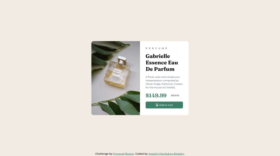
Product Preview Card Component with CSS flex
Design comparison
Solution retrospective
Applying media query to my CSS code to make it responsive for mobile devices seem like another daunting task. I feel thrilled completing this project despite the fact that it's not near perfection. I would be glad to get a helpful feedback from the community..Thanks in anticipation.
Community feedback
- @obocanegra-devPosted over 1 year ago
Hello Joseph! 👋
I wanted to congratulate you on your excellent desktop design work for the Frontend Mentor project. The design looks fantastic, and you have done a great job on this part.
However, I would like to give you some recommendations for the mobile design aspect. I suggest adjusting the breakpoint to a higher pixel value to enhance the experience on smaller devices. Additionally, I highly recommend starting your projects with the "mobile first" approach as it is a good practice to ensure an optimal user experience on all devices.
When it comes to font sizes, it is important to avoid using pixels as the unit. Instead, I would recommend using relative units such as
rem
orem
. This will ensure that the font size adjusts appropriately across different devices and zoom settings.Furthermore, remember that this project included two images, one for the mobile design and another for the desktop design. Make sure to include both images in your implementation to maintain visual consistency across all screen sizes.
Another important suggestion is to add a description in the
alt
attribute of the perfume image. This will allow screen readers to describe the image to users with visual impairments, thereby improving the accessibility of your site.Lastly, it is essential to follow proper heading hierarchies. Ensure that you have at least one
h1
in your document and use headings in a logical order. It is not appropriate to have anh4
above anh3
. This will help search engines and screen readers better understand the structure of your content.I hope you find these tips helpful. Remember, they are just suggestions to further improve your work. Keep going and continue honing your skills!
Best of luck with your future projects! 🚀✨
Warm regards, Oscar
Marked as helpful0@KingsleyChukwuPosted over 1 year ago@obocanegra-dev I must say I am very grateful for this great exposition and suggestions as this would go a long way in building my understanding and knowledge of web coding...Although, I am just starting out and some of the concepts you mentioned earlier seemed not relatable...Concepts like mobile first approach and proper heading hierarchies..I guess I have a lot of assignments to do..Thanks for your making out time to really educate me
1
Please log in to post a comment
Log in with GitHubJoin our Discord community
Join thousands of Frontend Mentor community members taking the challenges, sharing resources, helping each other, and chatting about all things front-end!
Join our Discord