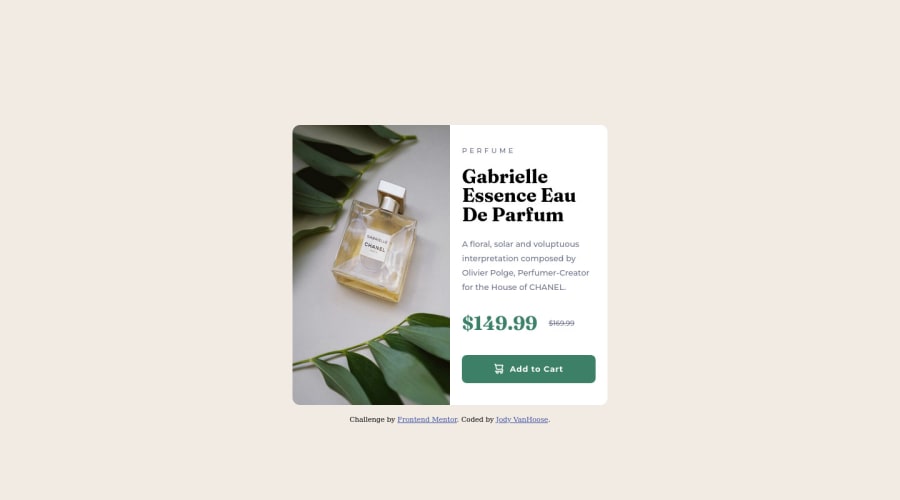
Product-preview-card-component with using HTML, CSS, and CSS Flexbox
Design comparison
Solution retrospective
Just looking for some general feedback. Thanks!
Community feedback
- @elaineleungPosted over 2 years ago
Hi Jody, first off, great job in getting your solution to look very close to the design! 🙂 I think you did many things well; for instance, I like how readable and well-annotated your code is. There are just a few things I noticed in the area of responsive design that you can check out:
Breakpoint: The breakpoint is quite large, and you'll notice that the photo in the mobile view gets pixelated past its width of 686px, plus having the mobile view at such a wide width is not very optimal for this card component, as the photo would be gigantic while the lines of text and CTA button gets stretched. What I suggest is to use a smaller breakpoint: to find ideal point, simply see how wide the desktop view is meant to be and use that as a starting point. From what I recall, the design's desktop width should be about 600px.
Image distortion: The image at the desktop view is getting distorted, meaning that the original aspect ratio is being changed. To make sure the image doesn't get stretched or squished, add a
object-fit: coverto the image class.Component width: Aside from changing the breakpoint, one other thing you can try is to ensure the mobile view card width doesn't get too wide. To do that, instead of just having
width: 93%, trywidth: min(93%, 400px);which tells the browser to keep the width at 93% if the width is smaller than 400px (you can use any value here you wish). Likewise, for the desktop view, trywidth: min(93%, 600px);instead ofwidth: 35%. Once you do that, you may find that thewidthproperty for your desktop image doesn't have to be 25%; in fact, it can be 100% or 50% and still be the same width because you haveflex: 1as a declaration, and you also have awidth: 50%for your description container.Hope this can help you out!
Marked as helpful0 - Account deleted
Hey there! 👋 Here are some suggestions to help improve your code:
- To not only improve your HTML code but to also identify the main content of you page, you will want to wrap your entire component inside the
mainelement.
More Info:📚
- The image’s
alt tagdescription needs to be improved upon to better describe what it is. You will want to assume that you are describing the image to a someone.
More Info:📚
https://www.w3.org/WAI/tutorials/images/
- This component requires the use of two images 🎑 at different breakpoints. The
pictureelement will facilitate this.
Here is an example of how it works: EXAMPLE
Syntax:
  <picture>
    <source media="(min-width: )" srcset="">
    <img src="" alt="">
  </picture>
More Info:📚
https://www.w3schools.com/html/html_images_picture.asp
- Currently, the old price (169.99) 🏷 is not being properly announced to screen readers. To fix this, you are going to wrap the the price in a
delelement and inside it you will add aspanelement with ansr-only classthat will state something like “The previous price was…” and use CSS to make it only visible to screen readers.
More Info:📚
- The
attributionshould be wrapped in afooterelement.
If you have any questions or need further clarification, feel free to reach out to me.
Happy Coding!🎄🎁
Marked as helpful0 - To not only improve your HTML code but to also identify the main content of you page, you will want to wrap your entire component inside the
Please log in to post a comment
Log in with GitHubJoin our Discord community
Join thousands of Frontend Mentor community members taking the challenges, sharing resources, helping each other, and chatting about all things front-end!
Join our Discord
