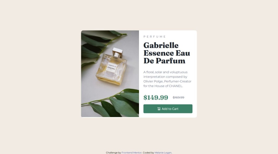


Design comparison

Solution retrospective
My goal for this challenge was to use flex and grid for the responsive design, making sure to not rely on fixed widths or heights. Also, I used the picture tag to size the image for mobile and desktop without having to use media queries.
What challenges did you encounter, and how did you overcome them?I attempted to use portrait and landscape modes to accommodate users turning their devices in different directions, but I could not get it to work well for tablets, so I commented it out.
What specific areas of your project would you like help with?I'd like to make the designs more responsive by using more automatic sizing for things like images and containers. I couldn't quite get it with the picture for this challenge. Also, I'd like to use the portrait and landscape media queries, but need help figuring out how to size for various devices.
Community feedback
- @AdityaNair07Posted 2 months ago
Great work Melanie!! Hope to see more of such solutions😁
0

Please log in to post a comment
Log in with GitHub
Join our Discord community
Join thousands of Frontend Mentor community members taking the challenges, sharing resources, helping each other, and chatting about all things front-end!
Join our Discord