

Design comparison

Solution retrospective
I gained a better understanding of media queries and think my styles improved a little; they're clearer.
This implementation starts with mobile first.
What challenges did you encounter, and how did you overcome them?Managing media queries, em/rem, and the screen's width are challenging.
I need to practice more CSS with using em/rem units measurement.
What specific areas of your project would you like help with?I'm not confident that I did the sizes correctly compared with the Figma.
Community feedback
- @prafullofcodePosted 6 days ago
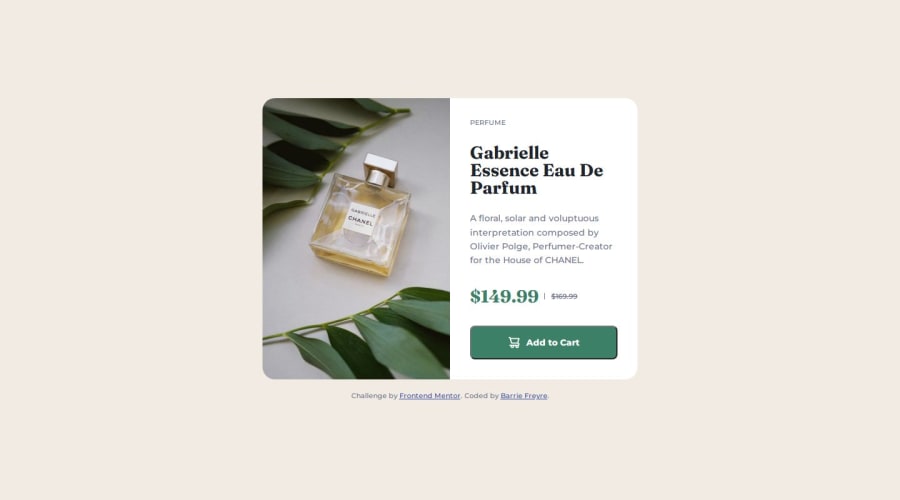
To improve the design, you could add some letter-spacing to the word "perfume" to make it a bit more readable and less cramped. Something like letter-spacing: 0.05em should help.
For the "Add to Cart" button, adding cursor: pointer; will make it clear to users that it's clickable.
Also, centering the discounted price alongside the original price (with the line-through effect) would make the layout look cleaner and more balanced. You can do this by using Flexbox or adjusting the text alignment so both prices are centered.
Marked as helpful0

Please log in to post a comment
Log in with GitHubJoin our Discord community
Join thousands of Frontend Mentor community members taking the challenges, sharing resources, helping each other, and chatting about all things front-end!
Join our Discord