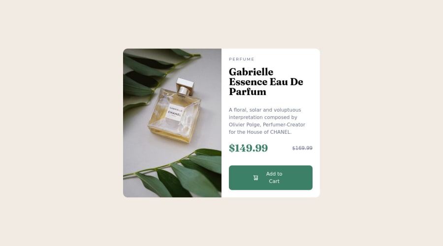
Design comparison
SolutionDesign
Solution retrospective
If anyone has any feedback on things I could do better, let me know!
One question - what should I replace the margin-right with on the add to card img so that on smaller screens the text doesn't stack?
Community feedback
Please log in to post a comment
Log in with GitHubJoin our Discord community
Join thousands of Frontend Mentor community members taking the challenges, sharing resources, helping each other, and chatting about all things front-end!
Join our Discord
