Not Found
Not Found
Not Found
Not Found
Not Found
Not Found
Not Found
Not Found
Not Found
Not Found
Not Found
Not Found
Not Found
Not Found
Not Found
Not Found
Not Found
Not Found
Not Found
Not Found

Submitted

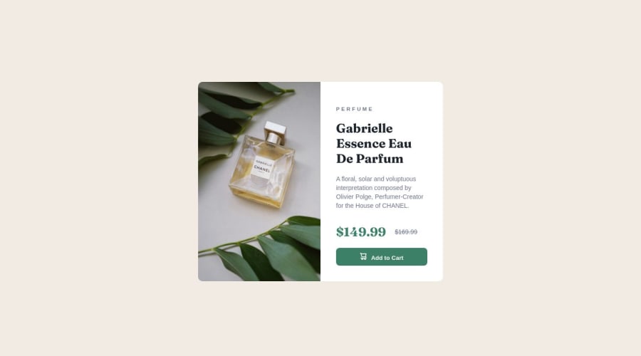
Product preview card component

@BrandaoA

Desktop design screenshot for the Product preview card component coding challenge

This is a solution for...

  • HTML
  • CSS
1newbie
View challenge

Design comparison


SolutionDesign

Solution retrospective


Didn't do the mobile view because im still to study how to do it. Feedbacks will be very much welcomed.

Community feedback

@jen67

Posted

Your solution is lovely. Well done. For mobile view, you can use media query. example you can change the flex-direction of your card to column and then adjust the width of your of your image and the other container to fit properly.

@media only screen and (max-width: 600px){
.card{
flex-direction: column;
}
}

You can learn more about media querries: here

Also to change the image to the mobile image on smaller screens you can enclose your images in a picture tag. example.

<picture>
<source media="(max-width: 700px)" srcset="./images/image-product-mobile.jpg"/> //where this represents your mobile view image
<img src="./images/image-product-desktop.jpg" alt=" "> //where this represents your desktop view image
</picture>

This is a link to learn more about this: picture-tag

Marked as helpful

0

@BrandaoA

Posted

@jen67 thanks I really needed this

0

Please log in to post a comment

Log in with GitHub
Discord logo

Join our Discord community

Join thousands of Frontend Mentor community members taking the challenges, sharing resources, helping each other, and chatting about all things front-end!

Join our Discord