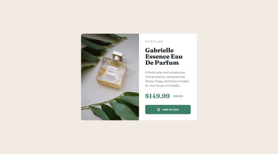
Product preview card component using Vue


Design comparison

Solution retrospective
I learned how to switch between a column and row layout.
What challenges did you encounter, and how did you overcome them?The quality of the Figma mockups weren't as professional as in other challenges unfortunately. That's why it was a bit hard for me to understand everything correctly.
Community feedback
- P@JomagenePosted 8 months ago
You're doing an amazing job with this project! The folder structure is impressively organized, and your use of variables shows great skill—well done! I genuinely enjoyed reviewing the presentation; it’s nearly pixel-perfect in matching the design. The only thing I noticed was a tiny mismatch in some padding, but it's hardly noticeable.
One suggestion to make your project even better is to use
remfor font sizes instead of pixels. This will help ensure that your design adapts beautifully when users adjust their preferred font size in the browser. You can check out this article for more insights.For accessibility, using the
maintag as your primary container and wrapping images in afiguretag would be a great enhancement.I’ve really tried to find areas for improvement, but honestly, you’ve done a fantastic job! Keep up the excellent work—your attention to detail is clear.
One final tip: consider using
emfor paddings instead ofrem. Since padding is related to the parent element,emcan be a better choice. This resource might be helpful.Keep pushing forward !
1P@MichaHuhnPosted 8 months ago@Jomagene Thanks for your feedback!
- I'm actually using
remfor font sizes. - That's a good idea to use
emfor certain paddings. However, the Frontend Mentor challenges usually use a design system for spacing, e.g.--spacing-200: 1rem;. That's why I used these spacing variables which are based onrem. How would you deal with that?
0P@JomagenePosted 8 months ago@MichaHuhn You're welcome! I'm glad my feedback was helpful.
Sorry for confusing, I saw letter-spacing:5px, which could be better using em. Great to hear that you're already using rem for font sizes—awesome work! Regarding your question about spacing, using a design system with spacing variables based on rem is a solid approach, especially for consistency across the project. If you want to explore using em for specific paddings while maintaining the design system, one idea could be to create additional variables for those cases. For example, you could define padding variables like --padding-em-200: 1em; that you use when you want the padding to scale with the parent element instead of the root.
That said, if the design system is working well for your project, sticking with rem might be perfectly fine. It's all about finding the right balance for the specific needs of the project.
Keep up the great work, and feel free to reach out if you have any other questions or ideas to discuss!
Marked as helpful1 - I'm actually using

Please log in to post a comment
Log in with GitHub
Join our Discord community
Join thousands of Frontend Mentor community members taking the challenges, sharing resources, helping each other, and chatting about all things front-end!
Join our Discord