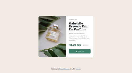
Product Preview Card Component using SASS and BEM

Solution retrospective
👋 Hi There! Frontend Mentor community. This is my solution for the Product preview card component
I feel quite confident using SASS in my code, because in my training I studied it very hard. In addition, I have my own framework prepared in SASS with all the functions prepared and other elements that I need. I also always use the BEM methodology to try whenever I can to program with the "clean code" philosophy.
I have also used a shadow on the card for the active design, so that the functionality is appreciated.
If you can add something or give me some tip abour my code, I will appreciate it :) . I'll be happy to hear any feedback and advice!
Tip: always remember to compile your clode on the command line $ sass --watch ./styles.scss ./styles.css
Enjoy programming!! jocodev
Please log in to post a comment
Log in with GitHubCommunity feedback
No feedback yet. Be the first to give feedback on jocodev's solution.
Join our Discord community
Join thousands of Frontend Mentor community members taking the challenges, sharing resources, helping each other, and chatting about all things front-end!
Join our Discord