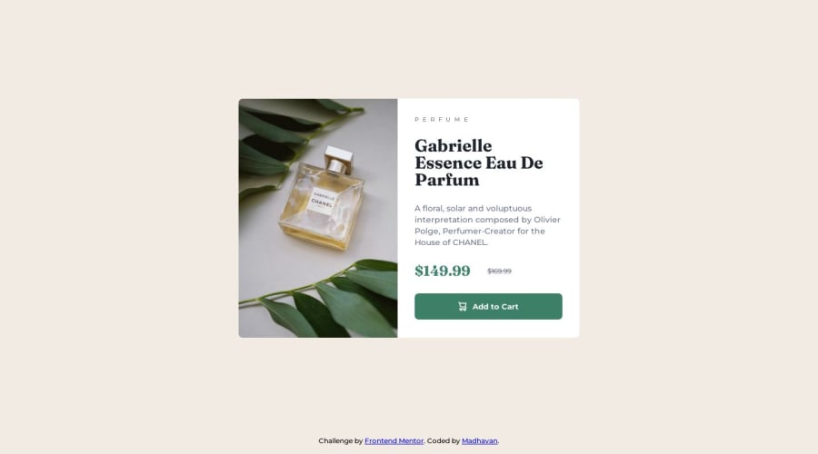
Product Preview card component using Responsive image switching
Design comparison
Solution retrospective
I have completed this as my 5th challenge on Frontend Mentors. I am glad to accept any feedback and suggestions regarding the accessibility and the techniques that I have used to develop the webpage.
If anybody my way of using the flexbox as wrong I am open to any suggestion about changing it. Can anyone check the BEM notation that I am using is a correct approach?
I have used the <picture> component using to make responsive image switching, I do know that there is an easy approach of using background-image property in CSS with @media query. But I wanted to experiment with it. Please comment if you have any thoughts about it.
Advance thanks for any comments 🫡.
Community feedback
- @danielmrz-devPosted 11 months ago
Hello @madhavan-ts!
Your project looks excellent!
About your questions:
- If anybody my way of using the flexbox as wrong I am open to any suggestion about changing it. Can anyone check the BEM notation that I am using is a correct approach?
I think you did a pretty good job there, following the Block__Element-Modifier structure.
- I have used the <picture> component using to make responsive image switching, I do know that there is an easy approach of using background-image property in CSS with @media query. But I wanted to experiment with it. Please comment if you have any thoughts about it.
The background-image technique can get you the same visual result, but since the image is not just decorative, I think the tag
pictureis a better option and make your HTML code more semantic.I hope it helps! 😊
1
Please log in to post a comment
Log in with GitHubJoin our Discord community
Join thousands of Frontend Mentor community members taking the challenges, sharing resources, helping each other, and chatting about all things front-end!
Join our Discord
