Not Found
Not Found
Not Found
Not Found
Not Found
Not Found
Not Found
Not Found
Not Found
Not Found
Not Found
Not Found
Not Found
Not Found
Not Found
Not Found
Not Found
Not Found
Not Found
Not Found

Submitted

Product preview card component using only html and css

@mohamed-magdy26

Desktop design screenshot for the Product preview card component coding challenge

This is a solution for...

  • HTML
  • CSS
1newbie
View challenge

Design comparison


SolutionDesign

Solution retrospective


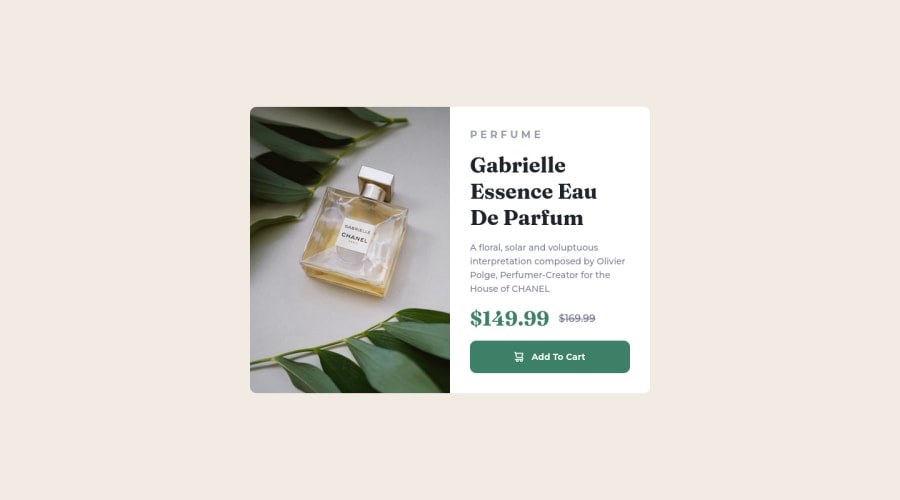
well, I'm feeling that the image part is not best practice is there anyway I can use img tag for image while changing the "src" attribute for different query ? I had to use background image for this to handle but I had a problem that the div has no height when I made the responsive design so I had to give it min-height to image height? also when I used the img tag when I increase gap between elements the component height increase but the image height did not which made a white area under the image

Community feedback

@scroft001

Posted

  • You can use the <picture> tag when you have different versions of the same image. Using the <picture> tag will help you to load the correct image for the user's device saving bandwidth and improving performance.
   <picture>
      <source media="(max-width: 460px)" srcSet={mobileImage} />
      <img src={desktopImage} alt="{your alt text goes here}" />
    </picture>

Marked as helpful

1
Jethier 390

@jCasia

Posted

Hello! First of all, congratz on completing the challenge!!😀

I was just looking at your code and wanted to help fix the responsiveness

@media (max-width: 687px) { 

.preview-card {
 grid-template-columns: 1fr;
 grid-template-rows: repeat(2, 1fr);  <--"Add this to specify how many rows you want in your grid,  your image does not know where to go, this should solve the problem"
 max-height: 40rem;  <--"add this so your card container won't get bigger than 40rem(640px)"
 margin: 0 2rem;  <-- "put a margin right and left to make it look neater"
  }

.preview-card .img {
 min-height: 360px;  <--"remove this as this will restrict the height to 360px and the image will not go any smaller, so this limits the image to resize in smaller widths"
 border-radius: 10px 10px 0 0;
 background-image: url(/images/image-product-mobile.jpg);

**when creating a grid, its good to specify which cells each element/div should be in the grid for example**

 grid-row:1/2;
 grid-column:1/2;
  }
}

I'm sorry if its a bit messy, but I hope I helped you out even its just a little bit

Marked as helpful

0

Please log in to post a comment

Log in with GitHub
Discord logo

Join our Discord community

Join thousands of Frontend Mentor community members taking the challenges, sharing resources, helping each other, and chatting about all things front-end!

Join our Discord