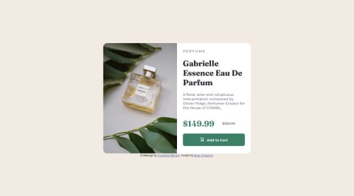
Product preview card component using @media and flexbox

Solution retrospective
My main takeaway from this challenge was understanding the importance of CSS rules and their priority. Having to make multiple sets of CSS rules with the @media rule is required to design a layout for desktop and mobile.
If I could do something different, it would be to learn more about responsive web design. While I was able to make the mobile design match the requirements. I was not able to make the desktop design fully responsive when the resolution started to become smaller than a certain width as it would be cut off instead of adjust as needed.
What challenges did you encounter, and how did you overcome them?The first challenge I encountered was making sure that based on resolution size that only the desktop or mobile image would be visible. Not only did it require using @media and (min-width) and (max-width) CSS rules. I had to disable both images from being seen and then have them be visible within the nested @media CSS rules.
What specific areas of your project would you like help with?What I need help with this project is to understand how to make every element in the HTML framework responsive.
I still have trouble understanding what I should be doing to have the text or images inside an HTML element be responsive as the resolution of the webpage increases or decreases in resolution.
Using div elements as containers and then using flexbox for each div element can't be the only solution. Because I don't know how to set a maximum size and then have it and the elements shrink when the resolution gets smaller. My designs always takes up the entire webpage unless I set a specific width and height in pixels but that removes the ability of the design to be responsive.
Please log in to post a comment
Log in with GitHubCommunity feedback
No feedback yet. Be the first to give feedback on Ryan O'Hanlon's solution.
Join our Discord community
Join thousands of Frontend Mentor community members taking the challenges, sharing resources, helping each other, and chatting about all things front-end!
Join our Discord