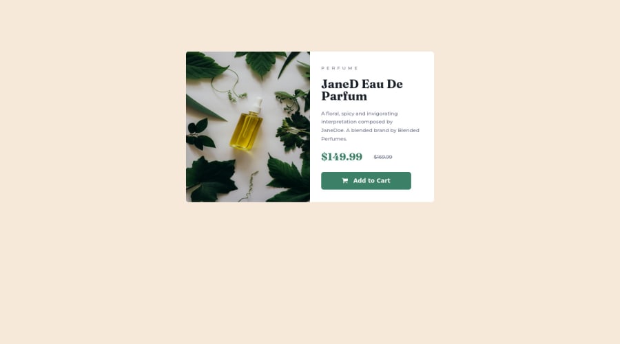
Product Preview Card Component using HTML, CSS and Flexbox


Design comparison

Solution retrospective
Can you let me know if I formatted the @media queries correctly for the screen sizes of 375px and 1440px? I added 768px for those screens. Is there a way to make all screen sizes responsive at once using HTML and CSS instead of catering to each viewport breakpoints? Also, how to get the item/s in the center of the page using either Flexbox or CSS or by using margins and padding. Do you use margin and padding on the body and HTML elements? How do you get the item on the page to be centered on various screen sizes for responsiveness? Thanks very much.
Community feedback
- @agnar-nomadPosted about 2 years ago
I can't comment on the code since the link is broken to it.
Centering is fairly easy with Flexbox, use justify-content and align-items, both centre. These properties should be used on the body element.
0@dquindara8Posted about 2 years ago@agnar-nomad Ok Agnar. Did you mean that the link I provided is not accessible? I will try to resend it again, sorry and thanks.
0

Please log in to post a comment
Log in with GitHub
Join our Discord community
Join thousands of Frontend Mentor community members taking the challenges, sharing resources, helping each other, and chatting about all things front-end!
Join our Discord