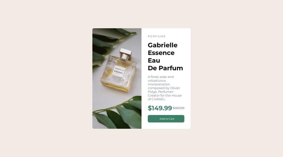
Design comparison
SolutionDesign
Community feedback
- @Harsh-Kumar-DwivediPosted 12 months ago
Hi @hosssa185,
Nice Work !
I would suggest following:-
1.Prefer to have a single container for card elements and consider it to be
<main>element.2.Try using only one
<h1>element for the webpage.3.Try giving the card more width and a bit lesser height.
4.For cart icon, prefer changing
srcattribute toimages/icon-cart.svg.Hope these suggestions are helpful !
Happy Coding !
0
Please log in to post a comment
Log in with GitHubJoin our Discord community
Join thousands of Frontend Mentor community members taking the challenges, sharing resources, helping each other, and chatting about all things front-end!
Join our Discord
