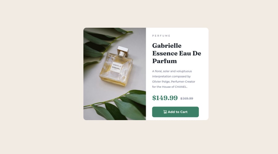
Product Preview Card Component - Using HTML and CSS
Design comparison
Solution retrospective
Please give me advice if I can improve something on this project.
Community feedback
- @MelvinAguilarPosted almost 2 years ago
Hello there 👋. Good job on completing the challenge !
I have some suggestions about your code that might interest you.
HTML 🏷️:
- Wrap the page's whole main content in the
<main>tag.
- Avoid using uppercase text in your HTML because screen readers will read it letter by letter. You can use the
text-transformproperty to transform the text to uppercase in CSS.
- The indentation of the code is inconsistent, making it difficult to read and understand. It's recommended to use a code formatter tool, such as Prettier, in your code editor to automatically format your code and maintain consistent indentation.
- The element
<div class="addcart" role="button">should be a button and not a div, since an element has a :hover state and has a pointer cursor it is considered an interactive element (buttons, links, etc).
Alt text 📷:
- The
altattribute should not contain underscores or hyphens, it must be human readable and understandable.
-
The
altattribute should not contain the words "image", "photo", or "picture", because the image tag already conveys that information.If you want to learn more about the
altattribute, you can read this article. 📘.
CSS 🎨:
- Unfortunately, your solution is not adapted for mobile devices :(, you should use media query to change the design of the solution, you can even learn mobile first approach so that the solutions are completely responsive.
- Consider adopting a Mobile First approach in your next project. This means designing for the smallest screens first and then scaling up as needed. This helps to create a more user-friendly and accessible experience for all users.
-
To center the component in the page, you should use Flexbox or Grid layout. You can read more about centering in CSS here 📘.
-
A simple way to create two columns in CSS is to use the grid layout 📐. Using the grid layout, you can create two columns by setting the display property of the parent element to grid and then defining the number of columns you want with the
grid-template-columnsproperty.Example:
<div class="container">
  <div>Column 1</div>
  <div>Column 2</div>
</div>

.container {
  display: grid;
  grid-template-columns: repeat(2, 1fr) /*  Creates two columns with equal width  */
}
I hope you find it useful! 😄 Above all, the solution you submitted is great!
Happy coding!
Marked as helpful0@Yashvir821Posted almost 2 years ago@MelvinAguilar Thank you so much for such advice.
1 - Wrap the page's whole main content in the
Please log in to post a comment
Log in with GitHubJoin our Discord community
Join thousands of Frontend Mentor community members taking the challenges, sharing resources, helping each other, and chatting about all things front-end!
Join our Discord
