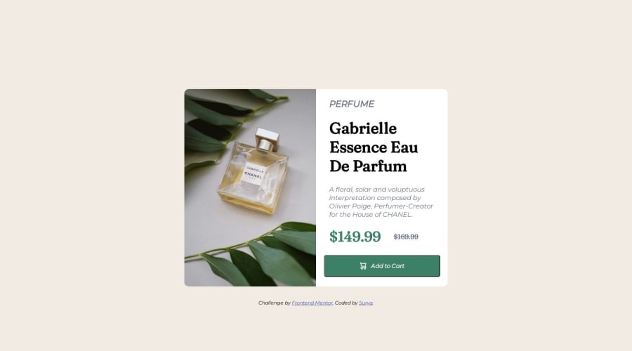
Product preview card component using Html & CSS
Design comparison
Solution retrospective
Hello My Name is Surya . Hope you guys doing well . Do check out my code and tell if any improvements can be made .
Community feedback
- @Bibiwei-PerePosted over 1 year ago
Hi
Congratulations on completing this challenge
You did great but I noticed the desktop and mobile version of your challenge is not properly centered. To fix this add the following CSS to your body
body {
display: flex;
align-items: center;
justify-content: center;
min-height: 100vh;
}
Overall, you did a great job 👍
Hope you find this helpful
Marked as helpful0@Surya8991Posted over 1 year ago@Bibiwei-Pere Thank you It worked but you forget to add flex-direction: column which if not added is aligned to row and not getting centered.
body{display: flex; align-items: center; justify-content: center; min-height: 100vh; background-color: hsl(30, 38%, 92%); font-family: 'Montserrat', sans-serif; flex-direction: column;}Thank you giving me such a valuable feedback
0 - @Bibiwei-PerePosted over 1 year ago
Okay bro, I'm glad I could help. Please let's connect on GitHub and twitter. I'm following you already.
0
Please log in to post a comment
Log in with GitHubJoin our Discord community
Join thousands of Frontend Mentor community members taking the challenges, sharing resources, helping each other, and chatting about all things front-end!
Join our Discord
