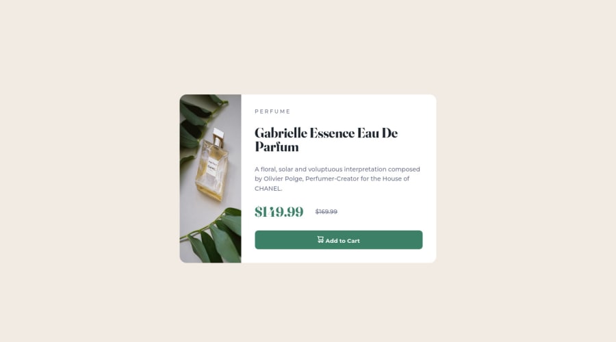
Design comparison
Solution retrospective
I would appreciate your advice on media query: if I wrote correctly etc. Thank you!
Community feedback
- @correlucasPosted about 2 years ago
👾Hello @Ejc2us10, congratulations for your new solution!
Here's some tips for you about responsiveness:
First of all you need to made the card responsive changing the class
cardreplacing thewidthwithmax-widthto allow the card to contract:.card { max-width: 600px; background-color: var(--white); border-radius: 16px; overflow: hidden; font-family: 'Montserrat', sans-serif; font-weight: 500; display: flex; flex-direction: row; }The you need to make the image responsive too using
display: blockandmax-width: 100%to make the image grow 100% of the container with and use alsoobject-fit: coverto make the image crop while scalingTo learnd about
media queriesandresponsivity, here’s a good resource to learn it: https://www.w3schools.com/css/css_rwd_mediaqueries.asp👋 I hope this helps you and happy coding!
Marked as helpful1 - @PaulawlietPosted about 2 years ago
for media queries I find it easy to do mobile first design before moving to larger screens and it's much easier to code, this is where I studied mobile first design and it helped me for responsiveness: https://www.youtube.com/watch?v=PM3XW_1RAIs&list=PL4cUxeGkcC9hH1tAjyUPZPjbj-7s200a4
1
Please log in to post a comment
Log in with GitHubJoin our Discord community
Join thousands of Frontend Mentor community members taking the challenges, sharing resources, helping each other, and chatting about all things front-end!
Join our Discord
