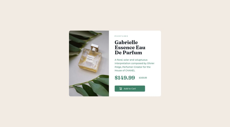
Product preview card component using HTML and CSS
Design comparison
Solution retrospective
- How can I make my code more clean and organized?
- Is there a better way to make it responsive playing with the width?
- How can we more easily organize the texts and boxes inside the container ?
Community feedback
- @visualdennissPosted over 1 year ago
Good work there!
"Is there a better way to make it responsive playing with the width?"
I'd suggest using some min-width: a-value-in-em and width: 100% and max-width: a-value-in-em is enough. Using % like 40% for widths is not a good idea as it can go out of the control, e.g. when i make the screen much wider, your right column of the .container seems to stretch out a lot. Avoid also using px for accessibility reasons.
You can include a cursor: pointer; to the button to indicate users that it is a clickable area, hence improving the user experience.
Hope you find this feedback helpful!
0 - @aaishverPosted over 1 year ago
get rid of accessibility report warnings and errors
use the mobile view image given by changing it with the media queries on mobile view
make sure to go through the all files given in challenge file and if active preview image given take notes of that too.
lastly do media queries that will help your website to be more responsive for 375px mobile view
0
Please log in to post a comment
Log in with GitHubJoin our Discord community
Join thousands of Frontend Mentor community members taking the challenges, sharing resources, helping each other, and chatting about all things front-end!
Join our Discord
