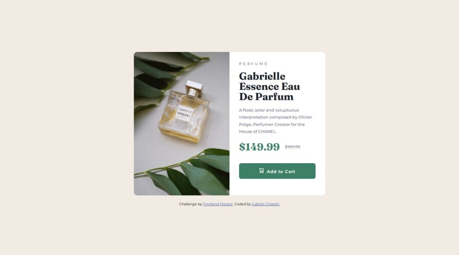
"Product preview card component" using Flexbox


Design comparison

Solution retrospective
Is getting easier to work with resposive layouts :)
Community feedback
- @Islandstone89Posted 9 months ago
Hi Gabriel, good job!
I hope you find my feedback helpful :)
HTML:
-
The alt text on the product image needs to be more descriptive. It should say what kind of product it is.
-
Use the
<picture>element to offer different versions of an image depending on screen size. -
"Perfume" is not a heading, but a
<p>. Remember, too, that headings must always be in order, hence you wouldn't start with a<h2>. -
To make it clear there's an old and a new price for screen readers, consider adding the following in the markup:
<p class="current-price"><span class="visually-hidden">New price</span>$149.99</p>
<p class="original-price"><span class="visually-hidden">Old price</span>$169.99</p>
And hide it using CSS:
.visually-hidden {
  clip-path: inset(50%);
  position: absolute;
  overflow: hidden;
  white-space: nowrap;
  width: 1px;
  height: 1px;
}
Here is an explanation of the properties being used.
- I would use the SVG for the cart icon.
CSS:
-
Including a CSS Reset at the top is good practice.
-
Remove the
widthandmin-heighton the card. -
Give the card a
max-widthof around50rem, so it doesn't stretch infinitely on larger screens. -
flex-direction: rowis the default, so there is no need to write it unless you need to override aflex-direction: columndeclaration. -
Media queries should be in rem.
0 -

Please log in to post a comment
Log in with GitHubJoin our Discord community
Join thousands of Frontend Mentor community members taking the challenges, sharing resources, helping each other, and chatting about all things front-end!
Join our Discord