Design comparison
Solution retrospective
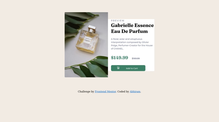
how to i match the size of both sections (image on the left & text on the right) as there was some problem with the right part... hence bottom portion (with button) is very close
Community feedback
- @0xabdulkhaliqPosted about 2 years ago
Hello there 👋. Congratulations on successfully completing the challenge! 🎉
- I have other recommendations regarding your code that I believe will be of great interest to you.
CSS 🎨:
- Looks like the component has not been centered properly. So let me explain, How you can easily center the component without using
marginorpadding.
- We don't need to use
marginandpaddingto center the component both horizontally & vertically. Because usingmarginorpaddingwill not dynamical centers our component at all states
- To properly center the component in the page, you should use
FlexboxorGridlayout. You can read more about centering in CSS here 📚.
- For this demonstration we use css
Gridto center the component.
body { min-height: 100vh; display: grid; place-items: center; }- Now remove these styles, after removing you can able to see the changes
.container {
  margin: 80px auto;
}
- Now your component has been properly centered
.
I hope you find this helpful 😄 Above all, the solution you submitted is great !
Happy coding!
Marked as helpful0 - @pperdanaPosted about 2 years ago
Hello there 👋. Congratulations on successfully completing the challenge! 🎉
I have feedback on your code, to solve it you can try
in style.css, on your
image-containerandrightselector update thewidthwith static value instead of using unit %, for example thewidthvalue is 250pximage-containerberfore.image-container { height: 20%; width: 20%; }image-containerafter.image-container { height: 20%; width: 250px; }rightbefore.right { background-color: hsl(0, 0%, 100%); height: 20%; width: 20%; padding-left: 20px; padding-right: auto; /* padding-bottom: 10px; */ border-top-right-radius: 4px; border-bottom-right-radius: 4px; /* margin: 0; */ }rightafter.right { background-color: hsl(0, 0%, 100%); height: 20%; width: 250px; padding-left: 20px; padding-right: auto; /* padding-bottom: 10px; */ border-top-right-radius: 4px; border-bottom-right-radius: 4px; /* margin: 0; */ }I hope you find it useful! 😄
Happy coding🤖
Marked as helpful0
Please log in to post a comment
Log in with GitHubJoin our Discord community
Join thousands of Frontend Mentor community members taking the challenges, sharing resources, helping each other, and chatting about all things front-end!
Join our Discord
