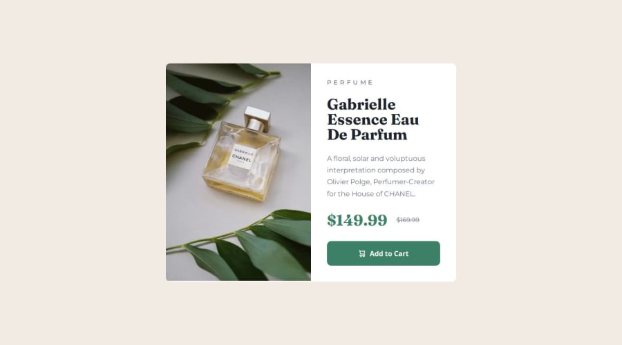
Product preview card component / Using Flexbox
Design comparison
Solution retrospective
👉In future projects I will continue focusing on using BEM. And for bigger projects I want to create multiple stylesheets for different parts of the application to structure e.g. global style, by thinking in reusable components.
What challenges did you encounter, and how did you overcome them?👉Finding a good looking starting point close to the design for mobile and desktop took a bit of time.
Community feedback
- @StroudyPosted about 2 months ago
Hello again, Incredible work on this! You’re making great strides, and I have a couple of suggestions that might push it even further…
-
For future project, You could download and host your own fonts using
@font-face
improves website performance by reducing external requests, provides more control over font usage, ensures consistency across browsers, enhances offline availability, and avoids potential issues if third-party font services become unavailable. Place to get .woff2 fonts -
This does not matter that much at this stage but something to be mindful of for SEO(Search Engine Optimisation),
<meta>
description tag missing that helps search engine determine what the page is about, Something like this<meta name="description" content="description goes here" />
You’re doing so well, and I hope this feedback is helpful! Keep honing your skills and remember to enjoy the process—you’re on a great path. Stay motivated, and happy coding! 🎯
Marked as helpful1@MarenOelixtownPosted about 2 months ago@Stroudy Thank you so much for your suggestions and improvements! 🙏
1@StroudyPosted about 2 months agoHey @MarenOelixtown, No problem at all, You did so well I really struggled to provide any feedback! Your smashing it! 💪
0 -
Please log in to post a comment
Log in with GitHubJoin our Discord community
Join thousands of Frontend Mentor community members taking the challenges, sharing resources, helping each other, and chatting about all things front-end!
Join our Discord