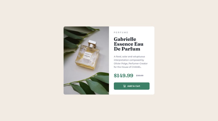
Product preview card component using Flexbox
Design comparison
Solution retrospective
I already submitted this challenge before but I couldn't understand why the screenshot was so different from my actual solution (font and spacing), after testing it in different browsers I came to the conclusion that it was a bug here in the platform, but then I realized that many other solutions had exactly the same problem and finally I figured it out, it was the "Fraunces" font family, when exporting from Google Fonts just uncheck the "Use Optical Size" option and it will fix it. If you have any advice I would appreciate it.
Community feedback
Please log in to post a comment
Log in with GitHubJoin our Discord community
Join thousands of Frontend Mentor community members taking the challenges, sharing resources, helping each other, and chatting about all things front-end!
Join our Discord
