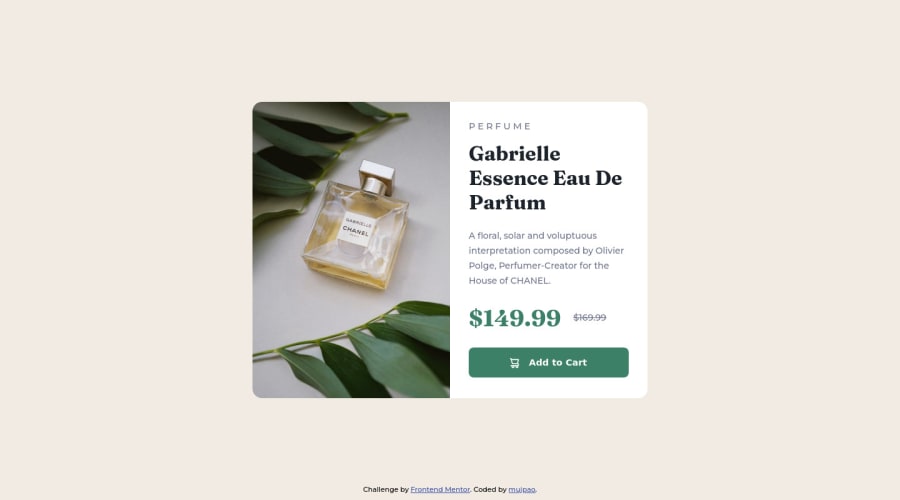
Design comparison
Solution retrospective
Any feedback welcome. :)
Edit: Just realized it doesn't look quite right in Firefox. Going to try to fix it.
Edit: I unchecked the "optical size" option on Google Fonts, and that worked perfectly. I also added margin around the card and made the category text line up with the text below it as suggested.
Community feedback
- @elaineleungPosted about 2 years ago
Hi mujpao, welcome to Frontend Mentor, and great job in completing your first challenge!
I'm viewing this on Firefox and I also checked it out on Chrome; it looks fine to me on both browsers. If you're wondering why the screenshot doesn't match the design, it's because you're using the optical view version of the Fraunces font. To have the screenshot look more like the design's, just grab the link from Google Font again, except this time uncheck the optical view version.
You did many things well there, including making this responsive. I'll just keep the feedback to a minimum and give two small suggestions:
-
You can add some margin around the card so that the sides won't touch the screen in smaller screen sizes.
-
I notice that in the desktop layout, "Perfume" is not aligned with the rest of the text, and then I saw how it is not grouped in the same container as the text. You can try grouping all the content into one container, and then in
card-container
, add padding to create space around the content so that you don't have to set a margin separately for two items.
I think that's good enough for now; great work and hope to see more!
Marked as helpful1@mujpaoPosted about 2 years ago@elaineleung Thank you for the feedback!
The tip about the optical size font was very helpful and saved me a lot of time.
I also followed your advice about lining up the "Perfume" text. For some reason, when I first looked at the design, I thought it looked like the text was offset to the left a little bit, but now that I look closer, I think you're right.
1@elaineleungPosted about 2 years ago@mujpao Glad I could help, and the alignment looks great! Btw, I just realized I mentioned I'd have "three small suggestions" but I was clearly having a brain fart moment and forgot what the third one was (maybe there wasn't one) 😅
1 -
Please log in to post a comment
Log in with GitHubJoin our Discord community
Join thousands of Frontend Mentor community members taking the challenges, sharing resources, helping each other, and chatting about all things front-end!
Join our Discord