Submitted over 2 years ago
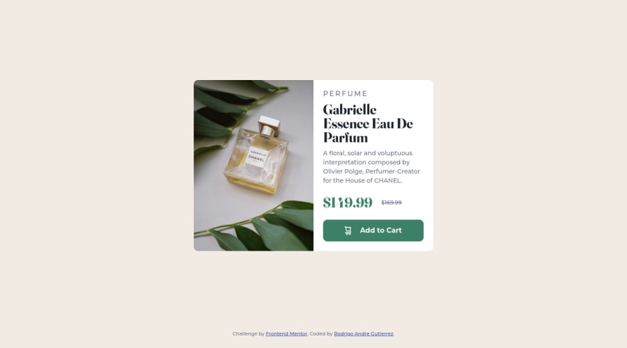
Product preview card component using flex and CSS Grid 😉

@rodrigoandregg

Design comparison
SolutionDesign

Community feedback
- @correlucasPosted over 2 years ago
👾 Hello Rodrigo, congratulations for your solution!
You've done a pretty good work in this solution, everything is fine.
The only detail to fix, is that the component is cropping due the
overflow: hidden;if you look in the mobile version when the screen scales until280pxthe text information start to hide, pay attention to the discount price for example, it disappears..flex { display: flex; flex-direction: column; gap: 20px; overflow: hidden; }You can fix that deleting the overflow and applying a media query to change the flex-flow column after 300px.
Hope it helps, happy coding!
0

Please log in to post a comment
Log in with GitHub
Join our Discord community
Join thousands of Frontend Mentor community members taking the challenges, sharing resources, helping each other, and chatting about all things front-end!
Join our Discord