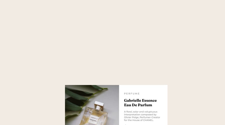
Design comparison
Solution retrospective
Regarding the desktop design, I'm not exactly sure that I did what was expected. I did my best to center the content (according to the desktop design photo), but I'm not sure if I'm semantically correct. So, any feedback is welcome.
Community feedback
- @gfunk77Posted about 1 year ago
Nice work. So, to center the card you want to wrap everything inside a div. Right now all your elements are just floating there and are not inside of a container. Then, use flexbox on the body and make the height min-height: 100vh; Lastly, format your code so that it is easy to read. Highlight everything and then right click, you should see an option to 'format code'. Great start on this. I think you are going to make this look really beautiful! I hope this is helpful.
body: {
min-height: 100vh;
display: flex;
justify-content: center;
align-items: center
}

<div class="card">
// all of your stuff here...
</div>
Marked as helpful1
Please log in to post a comment
Log in with GitHubJoin our Discord community
Join thousands of Frontend Mentor community members taking the challenges, sharing resources, helping each other, and chatting about all things front-end!
Join our Discord
