Not Found
Not Found
Not Found
Not Found
Not Found
Not Found
Not Found
Not Found
Not Found
Not Found
Not Found
Not Found
Not Found
Not Found
Not Found
Not Found
Not Found
Not Found
Not Found
Not Found

Submitted

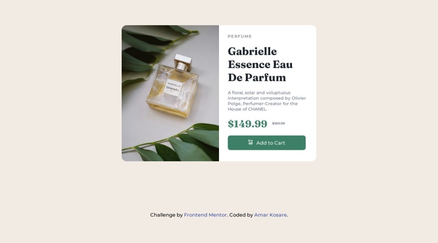
Product preview card component using CSS flex box

@amar215

Desktop design screenshot for the Product preview card component coding challenge

This is a solution for...

  • HTML
  • CSS
1newbie
View challenge

Design comparison


SolutionDesign

Solution retrospective


Tried my best to make it exactly as it was.

A little challenge I faced was when I was positioning the prices.

Community feedback

@0xabdulkhaliq

Posted

Hello there 👋. Congratulations on successfully completing the challenge! 🎉

  • I have other recommendations regarding your code that I believe will be of great interest to you.

PiCTURE TAG 📸:

  • Looks like you're currently using media queries for swapping different version of image, So let me introduce the picture element.
  • The <picture> tag is commonly used for responsive images, where different image sources are provided for different screen sizes and devices, and for art direction, where different images are used for different contexts or layouts.
  • Example:
<picture>
<source media="(max-width: 768px)" srcset="small-image.jpg">
<source media="(min-width: 769px)" srcset="large-image.jpg">
<img src="fallback-image.jpg" alt="Example image">
</picture>
  • In this example, the <picture> tag contains three child elements: two <source> elements and an <img> element. The <source> elements specifies different image sources and the conditions under which they should be used.
  • Using this approach allows you to provide different images for different screen sizes without relying on CSS, and it also helps to improve page load times by reducing the size of the images that are served to the user
  • If you have any questions or need further clarification, you can always check out my submission and/or feel free to reach out to me.

.

I hope you find this helpful 😄 Above all, the solution you submitted is great !

Happy coding!

Marked as helpful

0
Luka Glonti 3,440

@lack21

Posted

Great job 👍, but I have a suggestion!

  • Replace height: 100vh to min-height: 100vh in the body, the difference is that, when you set height: 100vh to something, that means it won't be bigger than that, it might cause some problems in the future, so better approach is to set min-height: 100vh, like this in case content is overflowing container will adjust to it!

Marked as helpful

0

@amar215

Posted

Thanks foe the suggestion

0

Please log in to post a comment

Log in with GitHub
Discord logo

Join our Discord community

Join thousands of Frontend Mentor community members taking the challenges, sharing resources, helping each other, and chatting about all things front-end!

Join our Discord