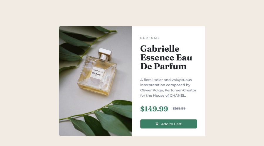
Product Preview Card Component Using CSS Flex and Media Query
Design comparison
Solution retrospective
Hey guys,
This was a tough one, for my coding level at the moment of course. I especially found it difficult making the layout responsive on mobile and I am somehow unsure of my media queries although the code works. Kindly advise on best practices.
This is my first challenge on Frontend Mentor. Please don't pass without leaving a feedback.
Thank you.
Community feedback
- @BenjaminNicholasWellsPosted about 2 years ago
Hey there Onyinyechi π
Everything is looking promising so far and all things considered your mobile layout looks the part and functions perfectly fine. I will however point you toward some minor improvements as requested:
1). For your picture element you only need the one source element within your picture element because essentially you are creating a media query for one picture and if that media query returns false then it falls back to the picture within the img element. You could realistically remove the second source element and the picture element will still serve its purpose.
2). Get into the habit of either converting your fixed px values into em/rem/% units or using min/max-width/height for your container dimensions and spacings instead. This will inherently introduce responsiveness to your websites as containers will resize as appropriate to the user's viewport. If the use of a fixed value is important to the design spec then I like to utilise the calc() functionality to implement a fixed value but ensure there is still some responsiveness baked into the container. Speaking of which:
2a). 400px widths for your containers will introduce horizontal scrolling on a majority of phones that have an intrinsic width of 375px and generate a poor user experience. The design style guide that accompanies these projects states the mobile design is made with a width of 375px in mind; be sure to respect those parameters. I tend to set my mobile design container widths as { width: calc(375px - 2rem); } to automatically give my layouts 1rem of space either side of my containers (you can make this responsive by doing { min-width: calc(100% - 2rem); })
3). I don't recommend using pseudo elements in your css file to insert commonplace content into your html if you can avoid it. It works for this project but imagine you were asked to make three containers that all looked similar to this one but the content and imagery was different. Instead of letting the css automatically style the price written into your html; you would have to go into your html to assign every price a unique selector and then go into your css to copy and paste the same ::after selector on them. With that said, the use of the ::before selector on your button to insert the icon was a great usage of the pseudo-class, nicely done on that.
4). You can easily give your cards rounded corners by giving the main container a border-radius value and setting the overflow property to hidden. This will make element parts that spill over the boundary of your container invisible, including the rounded corners.
5). Have a look into semantic html elements and why there are important for website navigation as well as search engine optimisation. You typically want to avoid using divs nested in the body element, instead find an appropriate semantic html tag and nest divs in there, for example the div with the container class could instead be a main element for this website or if you had more products on display each of these could become a section element. Also with these earlier projects Frontend Mentor place their .attribution inside a div which will throw up an accessibility issue because it's a div inside the main body of your html instead of a semantic html landmark. In future challenges they change this into making them wrapped in a footer element but it's a good habit to be conscious of changing that now.
Hope all this helps, all the best going forward!
Marked as helpful0@OnyinyexyzPosted about 2 years ago@BenjaminNicholasWells
Hey Benjamin,
I find your feedback very detailed and very helpful. Thank you so much for taking your time to pay attention to my solution.
0
Please log in to post a comment
Log in with GitHubJoin our Discord community
Join thousands of Frontend Mentor community members taking the challenges, sharing resources, helping each other, and chatting about all things front-end!
Join our Discord