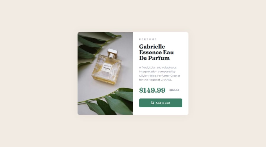
Design comparison
Solution retrospective
Any advice on code structure, semantic HTML elements and best practices in general would be welcomed, but any suggestions to improve my code in general will be extremely appreciated.
Thanks
Community feedback
- @ManuJosephShaji-projectPosted 7 months ago
Your HTML and CSS code is well-structured, ensuring a visually appealing and responsive product preview card component. It effectively utilizes Flexbox for layout design, making the content easy to align. The use of custom fonts and hover states adds a polished touch, and the inclusion of a media query for mobile responsiveness ensures a good experience on smaller devices.
To enhance this project consider improving the accessibility and performance. Adding alt text for the image in the background-image property of the .image-container would improve accessibility. Additionally, using relative units like rem or % instead of fixed pixel values for padding and margin would ensure better scalability across various screen sizes. You could also add aria-labels for the button to make it more screen-reader friendly. Finally, incorporating CSS Grid for the layout instead of Flexbox might offer more flexibility, especially when dealing with complex layouts or multiple breakpoints. I hope this will help full and happy coding😋
Marked as helpful0@Kurt3zPosted 7 months ago@ManuJosephShaji-project Thank you very much for the comments and the tips. Really appreciated it!
0
Please log in to post a comment
Log in with GitHubJoin our Discord community
Join thousands of Frontend Mentor community members taking the challenges, sharing resources, helping each other, and chatting about all things front-end!
Join our Discord
