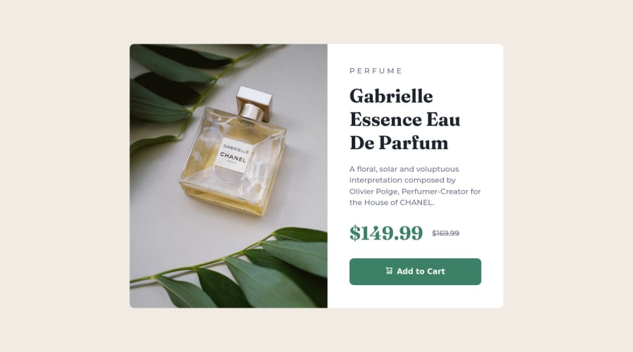
Design comparison
Solution retrospective
Currently I'm using CSS background property to change the source of the image accordingly. Is there a better way of doing it? Is it better to put supporting icons as an element beside the text or using pseudo css selectors. I'm currently using the ::before to insert the cart icon and wanting to know if that is the optimal solution?
Community feedback
- @correlucasPosted about 2 years ago
👾Hello @fritzadelbertus, Congratulations on completing this challenge!
Your solution its almost done and I’ve some tips to help you to improve it:
Use the THE PICTURE TAG that is a shortcut to deal with the multiple images in this challenge. So you can use the
<picture>tag instead of importing this as an<img>or using a div withbackground-image. Use it to place the images and make the change between mobile and desktop, instead of using adivorimgand set the change in the css withdisplay: nonewith the tag picture is more practical and easy. Note that for SEO / search engine reasons isn’t a better practice import this product image with CSS since this will make it harder to the image. Manage both images inside the<picture>tag and use the html to code to set when the images should change setting the devicemax-widthdepending of the device desktop + mobile.Check the link for the official documentation for
<picture>in W3 SCHOOLS:https://www.w3schools.com/tags/tag_picture.aspSee the example below:
<picture> <source media="(max-width:650px)" srcset="./images/image-product-mobile.jpg"> <img src="./images/image-product-desktop.jpg" alt="Gabrielle Parfum" style="width:auto;"> </picture>👨💻Here's my solution for this challenge if you wants to see how I build it: https://www.frontendmentor.io/solutions/product-preview-card-vanilla-css-and-custom-hover-state-on-hero-dVGWpOTgWS
✌️ I hope this helps you and happy coding!
Marked as helpful0@fritzadelbertusPosted about 2 years ago@correlucas Thank you for the explanation on using
<picture>! I rarely read documentation and after reading your explanation I think its time to start getting used to reading documentation.0 - @mbonamensaPosted about 2 years ago
Hey Fritz, Congrats on completing the challenge!
There is no optimal solution, I think you did a great job!
For the different images for different screen sizes, it is advisable to use
<picture>since the images are an important aspect of the site.For example:
<picture> <source media="(max-width: 375px)" srcset="./img/image-product-mobile.jpg"> <img src="./img/image-product-desktop.jpg" alt="Perfume with green leaf props"> </picture>This resource can help you understand better.
I also think the icons should be placed as images or svgs as well in the HTML, instead of using the pseudo-class selector.
I hope this helps.
Happy coding!
Marked as helpful0@fritzadelbertusPosted about 2 years ago@mbonamensa Thank you for the insight! I'll try using the
<picture>for future/next projects0 - @rachelktyjohnsonPosted about 2 years ago
Hey Fritz! I also used the background property to change the source of the image according to the screen size. I tend to favor this method when an image's dimensions can change. I personally inputted the SVG into the button so I could align it + text better.
1@fritzadelbertusPosted about 2 years ago@rachelktyjohnson I see... thank you for the comment! I guess that's the best solution so far..
0
Please log in to post a comment
Log in with GitHubJoin our Discord community
Join thousands of Frontend Mentor community members taking the challenges, sharing resources, helping each other, and chatting about all things front-end!
Join our Discord
